

 Exhibitions


From Luigi Moretti at the 1960 Triennale to Patrik Schumacher’s manifesto and the works of Zaha Hadid: a history of architecture that entrusts form to algorithms, and which seeks to evolve from a method into a style
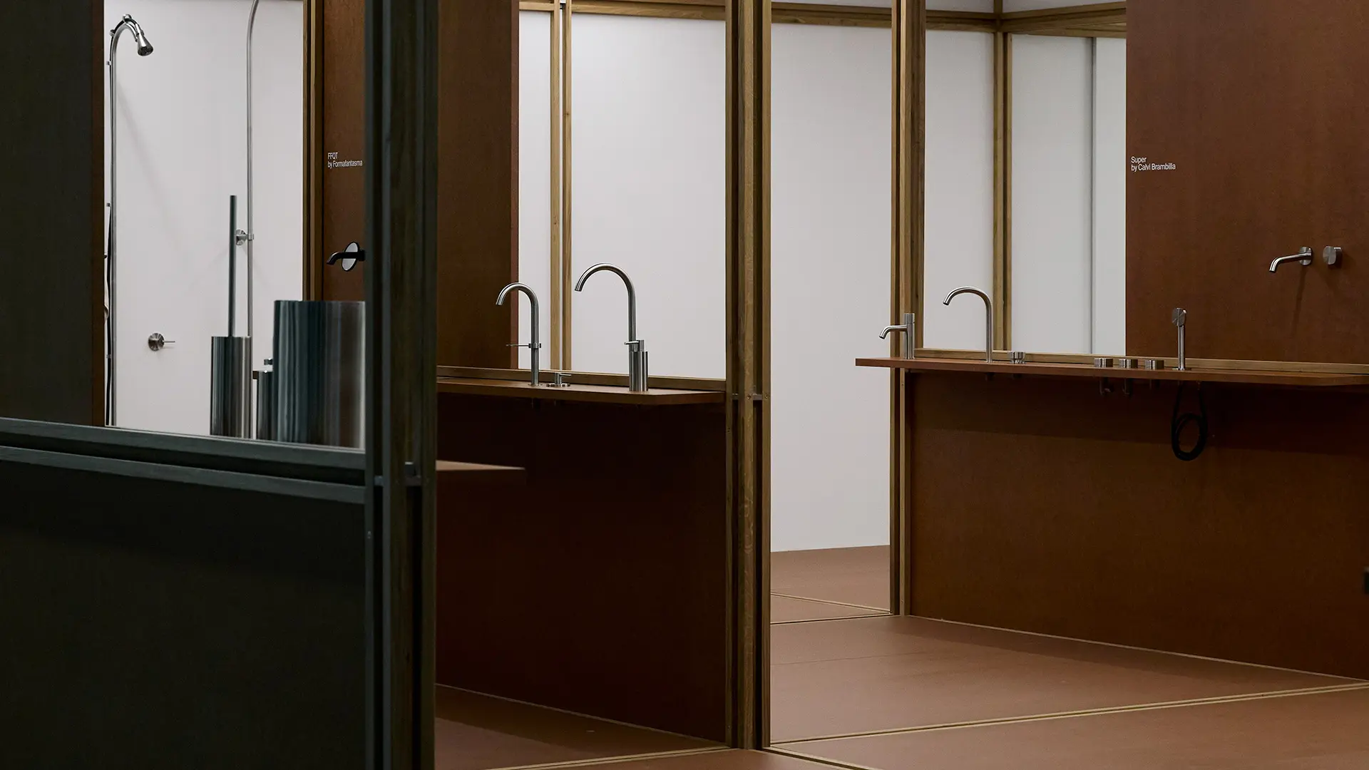
QuadroDesign, Salone del Mobile
The stands at the latest Salone proved to be a litmus test for the ideas driving companies, ranging from a quest for sustainability and domestic cosiness to tongue-in-cheek fun
One of the design aspects that inevitably comes up during the Salone del Mobile is the installations. Far from creating neutral boxes, stand design plays an essential role in framing and rendering a catalogue intelligible. It functions like a metronome that sets the tone for each collection and conveys its atmosphere and potential. At their best, exhibition installations also offer an opportunity to encourage designers to explore new spatial configurations, to interpret design from different angles and perspectives. And, not least, to unwrap the themes and emerging sensitivities that shape the work of these companies.
Of these, sustainability in all its multiple facets remained in the spotlight, as demonstrated by some of the most intriguing installations spotted at the latest Salone del Mobile.Milano. The QuadroDesign pavilion, an Italian company specialising in stainless steel taps and accessories, was entirely envisioned with a circular logic. The project, by Studio Giacomo Moor, was conceived with a long-term vision in mind. The elegant modular structure used for the stand, made of wood and made reconfigurable by the incorporation of a special aluminium joint, was dismantled and transferred to Masala, Zambia, thanks to a collaboration with Koalisation, an Italian company active in the carbon finance sector. Once fitted with walls and sanitaryware, the pavilion will be become a public toilet located not far from the town’s coal market, thus becoming a tangible legacy of solidarity - and a demonstration of how even the formats we take for granted can be reimagined in the light of new opportunities.
Tacchini Italia Forniture’s stand at the latest trade fair in Milan also introduced a new concept of architecture – fresh, fluid and atmospheric. The project, designed by Studio Cameranesi-Pompili and Studio LYS, drew inspiration from the codes of nomadism: rather than a succession of spaces defined by the perimeter of walls, suspended fabrics and filtering surfaces evoked the archetypal tent, making the transition more fluid, the outline less defined, and the perception softer. This device also aligns with Tacchini’s latest collections – think in particular of Faye Toogood’s work – in which the tactile dimension evoked by the typology, textures, and colours of the materials used is central.
Sustainability was one of the key themes in Knoll’s imposing pavilion, a project by the Belgian studio OFFICE (Kersten Geers and David Van Severen), now in its fourth year of collaboration with the American brand. The spacious, airy environment was distinguished by a structure of metal profiles segmenting the space and organising the exhibition areas. Some of these areas seemed to have been reclaimed by an apparently spontaneous, untamed nature, inviting a moment of mental relaxation. Made entirely from recycled and reused materials, the structure’s life cycle will be progressed at a future event.
Among the new products spotted at the fair were also some that seemed destined to shake things up. This was the case with the Italian Radical Design group, which includes the brands Gufram, Memphis and Meritalia®. For the first time, the group’s founders decided not to confine the products of all three brands to a traditional single-brand presentation, but to merge their visual identities to create an unexpected ‘Radical Home.’ This, however, was no cold fusion: their shared heritage, inextricably linked to the experimentation of the Italian Radical period, allowed the three collections to forge new dialogues, reinforcing the good-naturedly irreverent spirit of these icons. In order to bring out their potential within a domestic setting, the Radical Home structure, designed by the architectural firm (AB)NORMAL with creative direction and styling by Greta Cevenini, drew on clear Palladian neoclassical spatial organisation, highlighting a new possible interpretation of the space, poised between architectural order and the unpredictability of furnishings.
The Porro stand, designed by Piero Lissoni and again styled by Greta Cevenini, also evoked a domestic concept. Sheltered by a gabled roof, the archetypal symbol of domestic living, the design eschewed technical lighting, making for a more intimate and homely space. The structure, made of metal and now in its third consecutive year of use, has made longevity and circularity its hallmark. The walls, reduced to a minimum, are made of recycled and recyclable wood, whilst the furnishings are entirely reused in the company’s showroom.
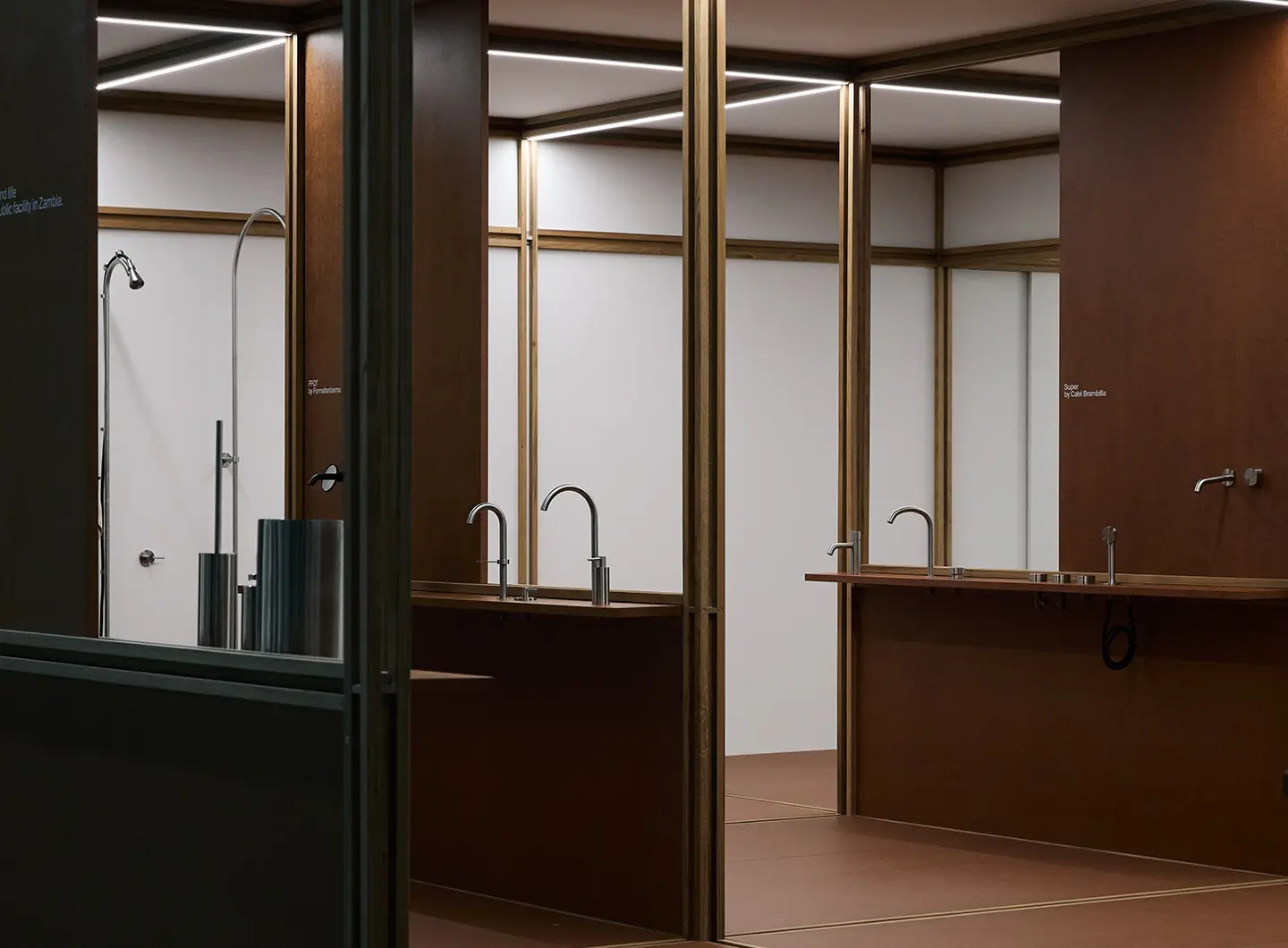
Quadro Design, Salone del Mobile 2026
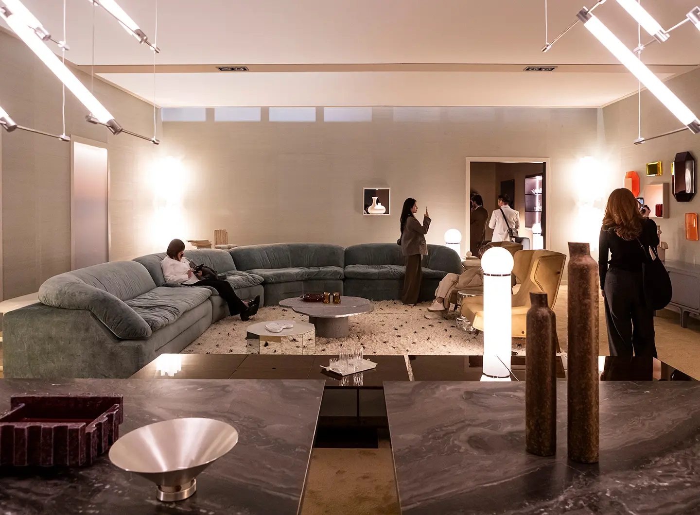
Tacchini, Salone del Mobile 2026
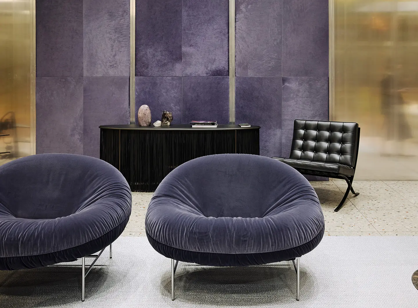
Knoll, Salone del Mobile 2026
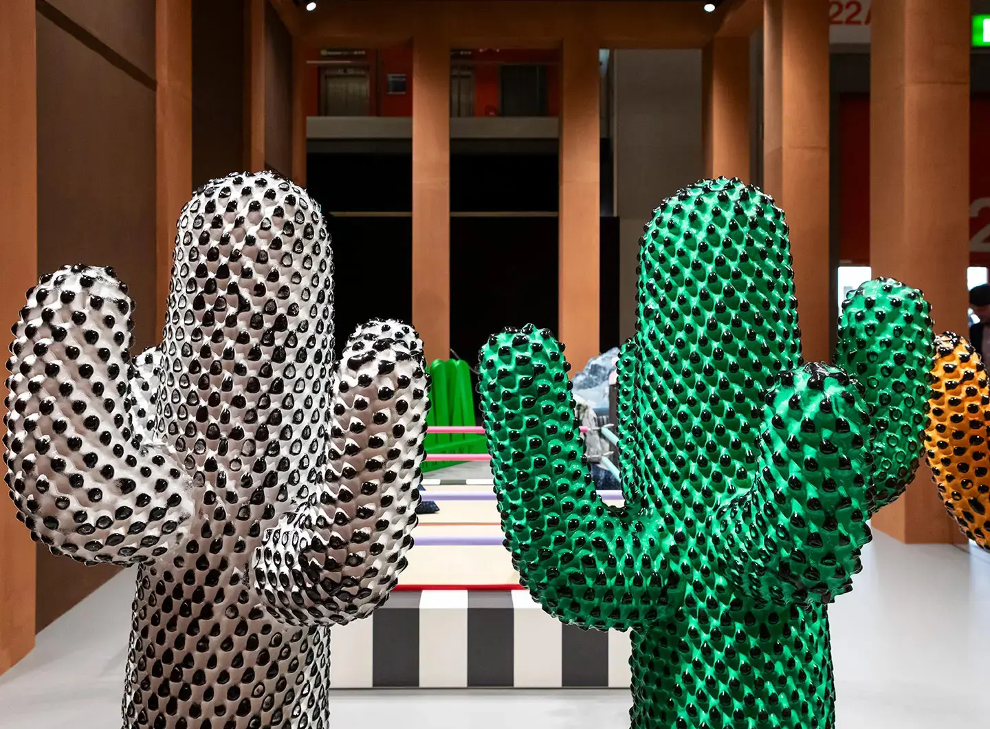
Gufram, Salone del Mobile 2026
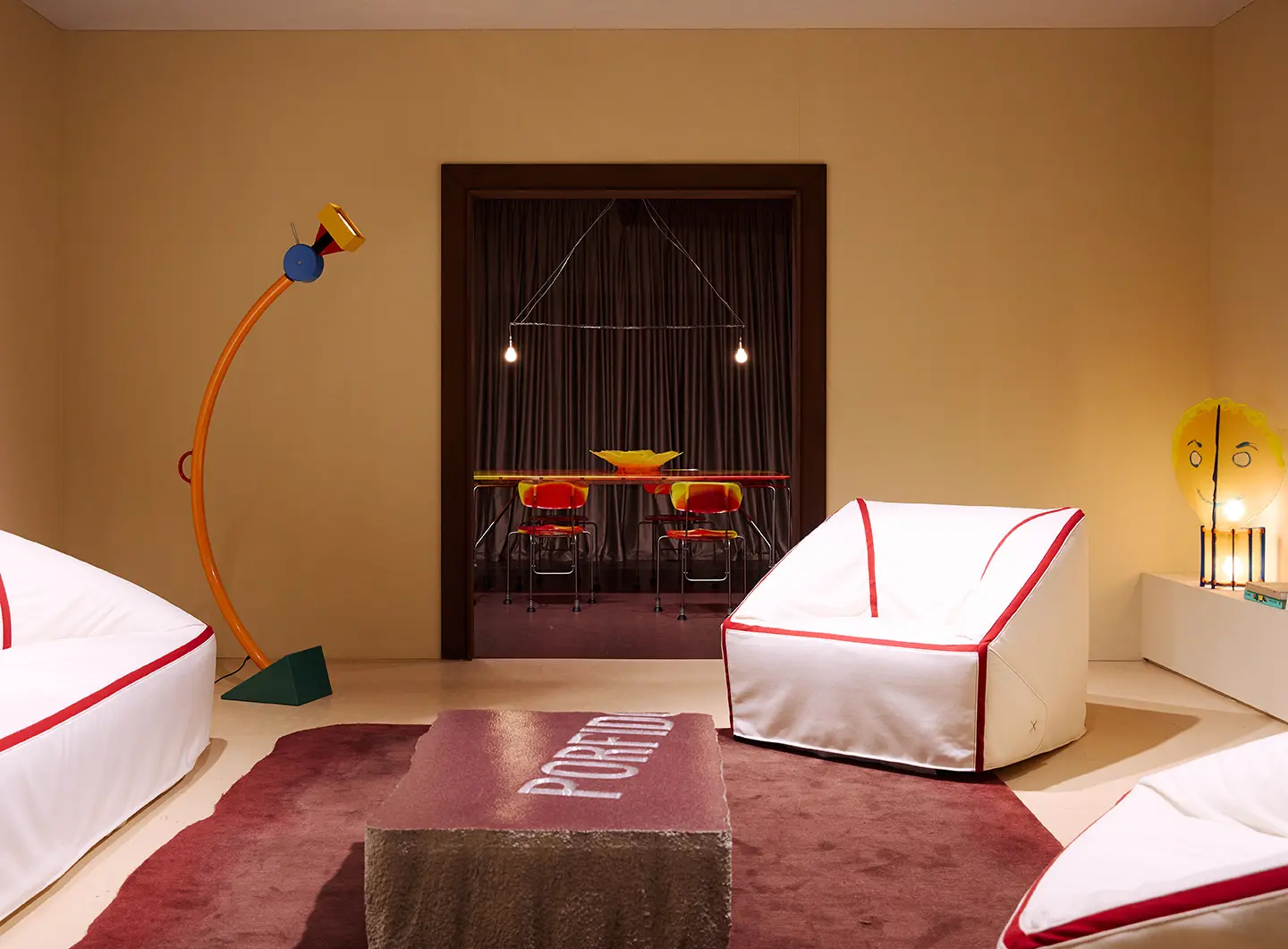
Memphis, Salone del Mobile 2026
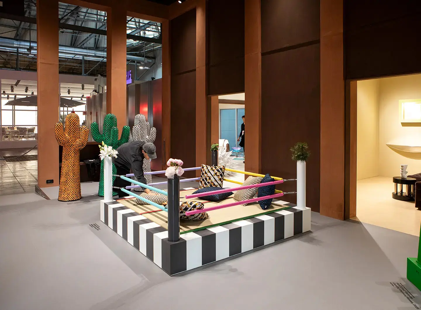
Meritalia, Salone del Mobile 2026
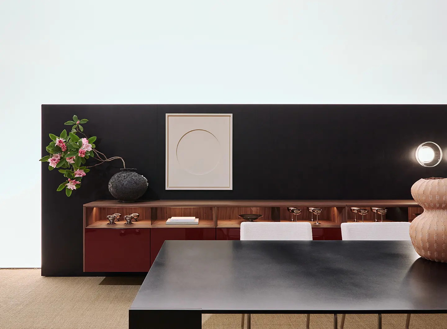
Porro, Salone del Mobile 2026
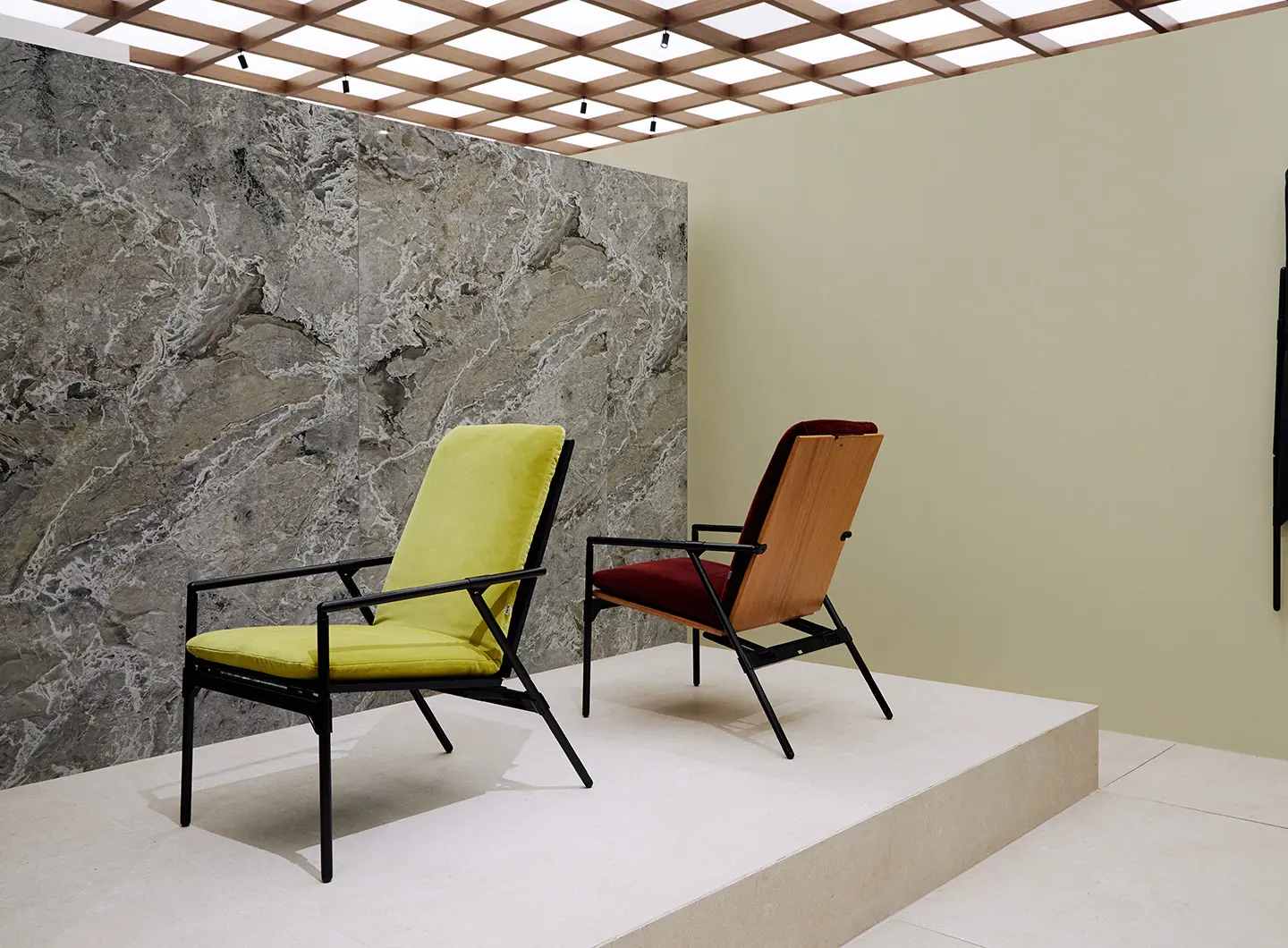
B&B Italia, Salone del Mobile 2026
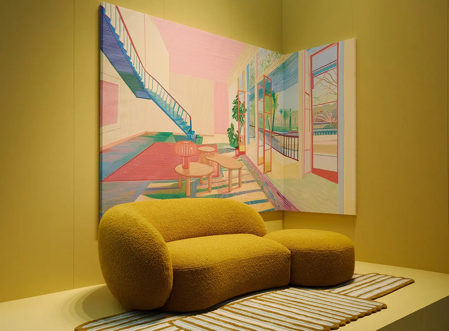
Kartell, Salone del Mobile 2026
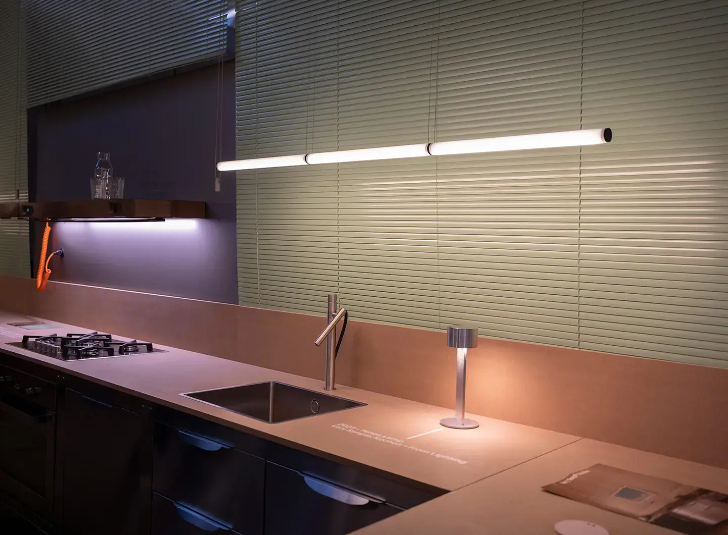
Very Simple : Kintchen, Salone del Mobile 2026
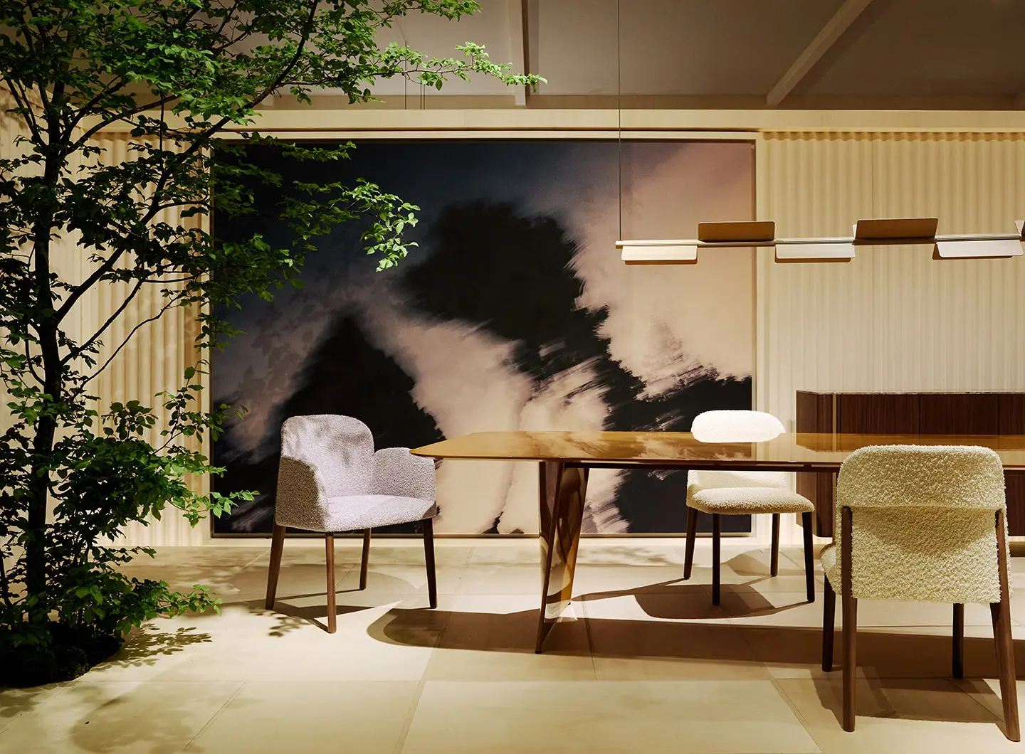
Pedrali, Salone del Mobile 2026
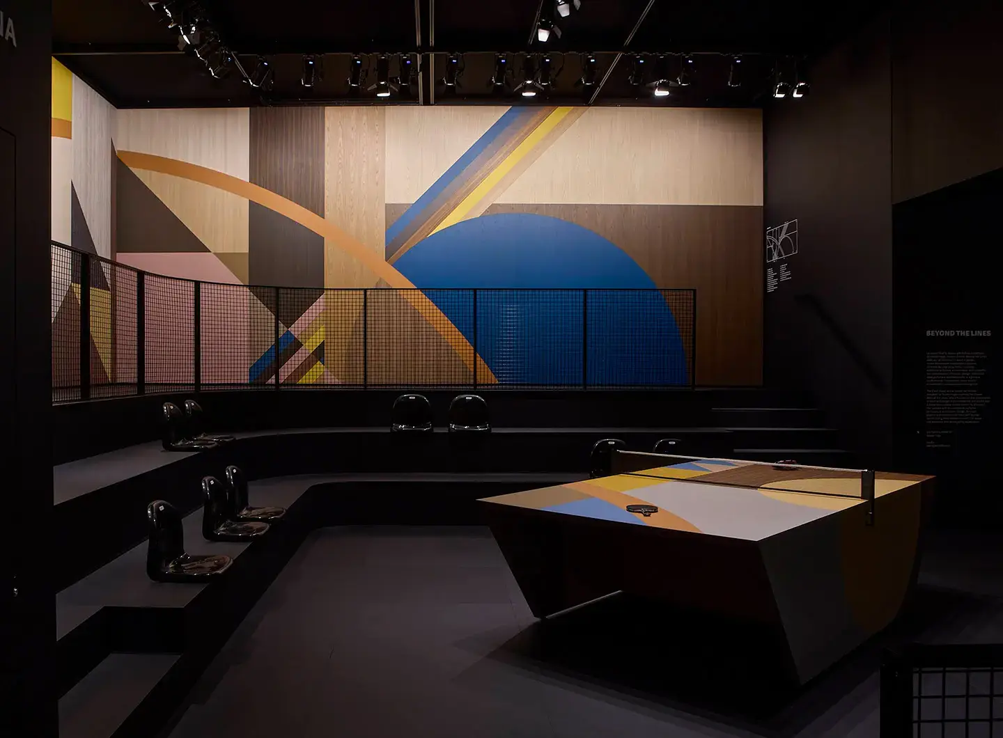
Cleaf, Salone del Mobile 2026
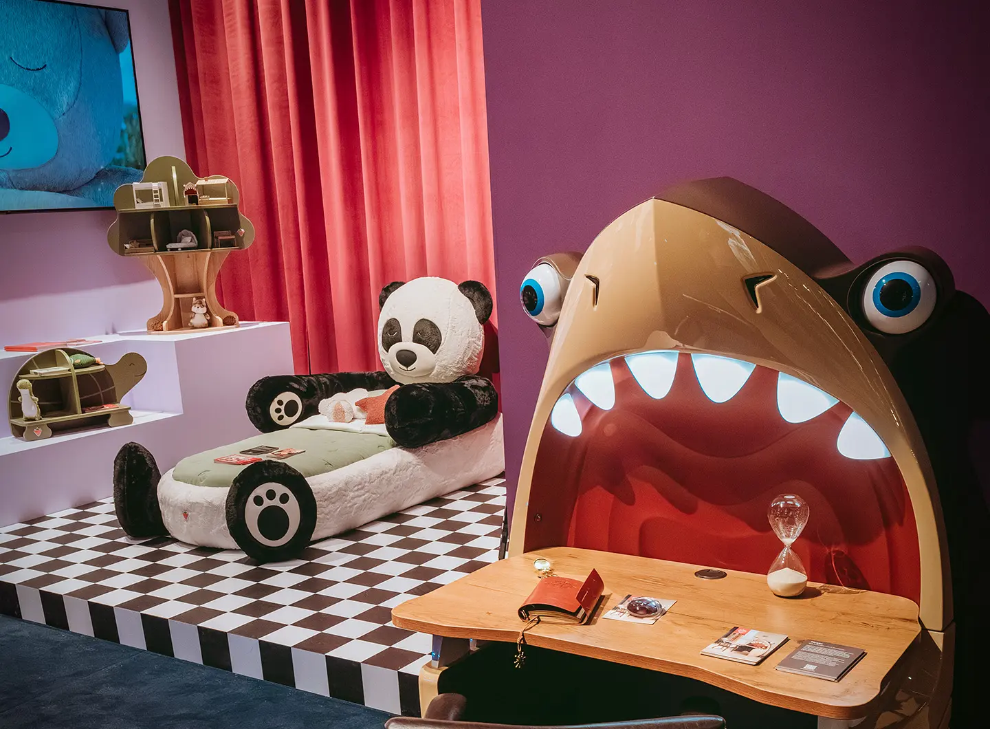
Çilek, Salone del Mobile 2026
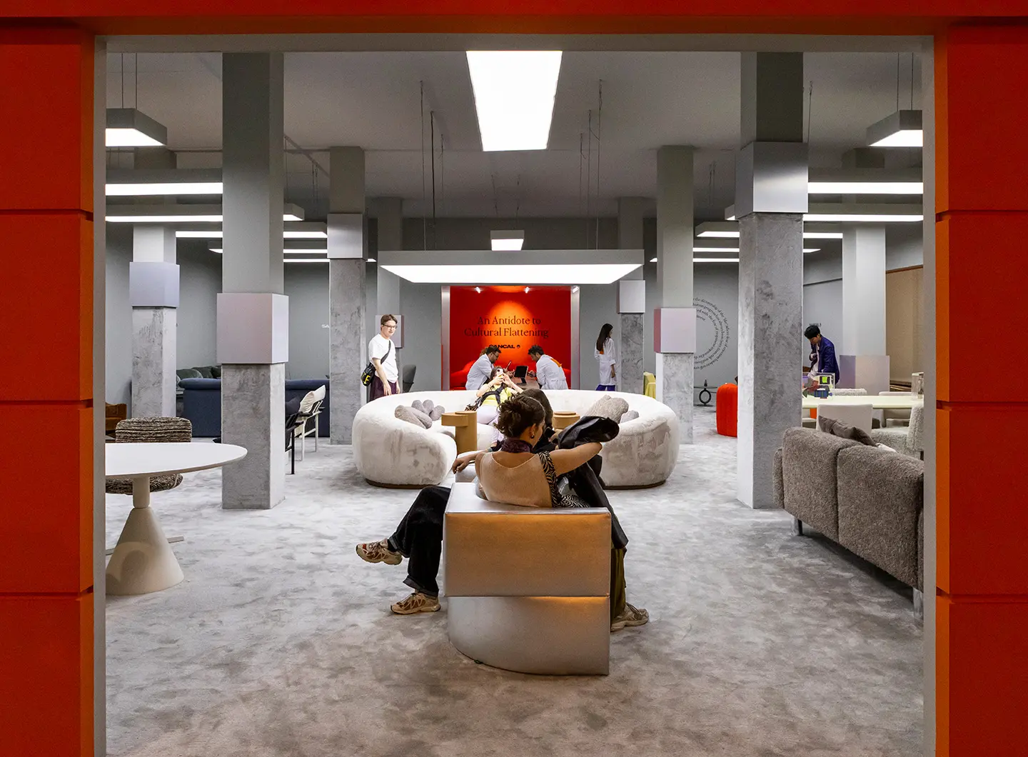
Sancal, Salone del Mobile 2026


The B&B Italia stand, on the other hand, adopted a product-focused design language. Counter to the desire for domestic reconstruction, the Italian brand opted for a minimalist box, enhanced by thoughtful use of materials, to refocus attention on the value and personality of each individual piece of furniture. Overhead light filtered in through the coffered ceiling, whilst marble partition walls and coconut fibre rugs underscored rhythm and spatial continuity.
Kartell’s approach was not far removed from this either. The new products were presented against the white backdrop of the structure precisely to highlight the materials, colours and character of each individual item. As visitors continued along the route, the display opened up into immersive settings designed to showcase the value of furniture and accessories in everyday life.
Over at Eurocucina, Very Simple : Kitchen also put the spotlight on the product, choosing to place a modular ‘smart shelf’ with an integrated hood at the centre of its stand, created in collaboration with Falmec and designed by Philippe Malouin. A way of clearly showcasing its innovation processes, but also of transforming its offering into a striking architectural language.
At Pedrali, the deliberately neutral exterior of the stand corresponded with the interior through a balanced and welcoming architectural identity. The poplar wood structure was complemented by textile surfaces, whilst canvas-clad undulating walls served to draw attention to the latest additions to the catalogue. Curated by DWA Design Studio, the project also incorporated a natural element: the tangible presence of real trees, along with a simulated one, provided by the images of the Milanese photographer Alecio Ferrari.
Last but not least, some of the installations focused on the playful dimension. Cleaf did just that, with a stand harnessing colour and geometry: the theme was the coming together of sport and design, with fun centred around a ping-pong table in the middle of the space. The children’s furniture brand Çilek designed a world in which fantasy and dreamlike life intertwined to enchant and amaze: amidst the stylistic elements of the stand’s classical architecture, the furniture turned into fantastical characters – the Shark Study Desk, the Turtle Bookcase and the Bunny Bed – evoking tongue-in-cheek, reassuring superheroes.
Finally, Sancal harnessed the Experimentarium concept to draw us into its vision: if good design means leaving one’s comfort zone, then it is better to surrender to creativity with a touch of irony. This was conveyed by the staff’s work jackets, which featured a large orange label bearing the words “an antidote to cultural flattening,” and a small window through which mysterious hands served drinks presented as “therapeutic refreshments”. A way of reminding us, once again, that even the installations can convey a message. To the point of becoming veritable manifestos, strong carriers of powerful concepts, vitality and wonder.
25 May 2026
Share