The new President Vincenzo Trione and General Director Carla Morogallo presented the strategic guidelines for the next four years. The new structure features the introduction of the position of Creative Director, entrusted to Michele De Lucchi, who also takes on the role of head of Triennale's Museo del Design Italiano
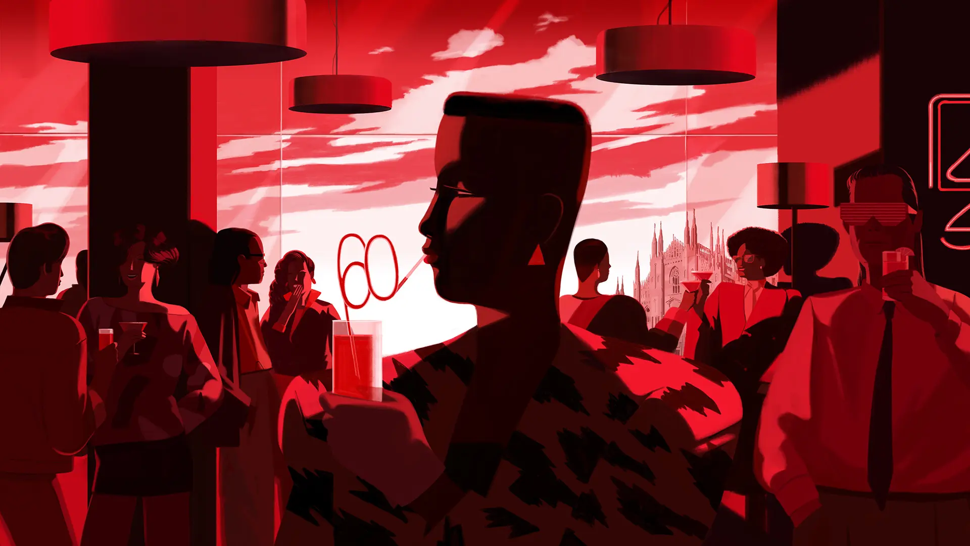
60 years of the Salone del Mobile.Milano turned into illustrations
Text by
Courtesy Salone del Mobile.Milano
We met Emiliano Ponzi in his studio and heard about “how” and “how fully” his illustrations tell the story of the most famous design event in the world
Emiliano Ponzi is a master at transposing images and “suspended” moments in time onto paper, which instantly become iconic depictions, while still leaving room for the imagination. His work is distinguished by his shapes, compositions, lines and chromatic scales. You could say design and architecture are inbuilt in his imagination and instinctive in the way he narrates the world. So, when the Salone del Mobile.Milano contacted him to ask whether he would like to produce the communication campaign for the 60th edition, his response was immediate, simple and spontaneous, despite the great responsibility. Emiliano’s task was to transfer everything that has already happened and the expectations of what is to come into the six posters he’s been commissioned to produce. That is to say, all the heritage, the charm and the customs that derive from six decades of history … and what a story! The story of the most important design event in the world. We wanted to find about this adventure. From start to finish.
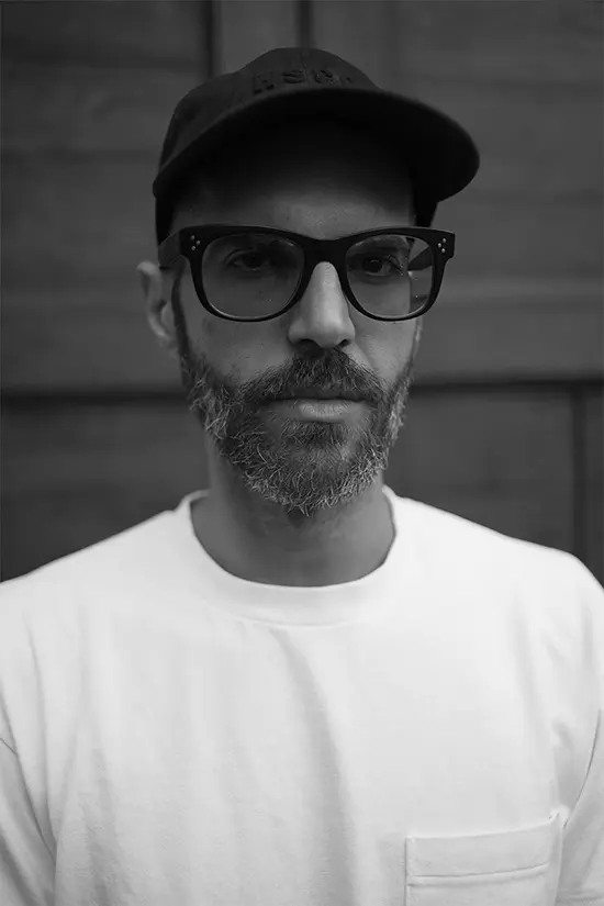
Emiliano Ponzi, ph. Ioan Pilat
The phone rings. It’s the Salone del Mobile.Milano. Not exactly the phone call you were expecting in late November. What was your first thought?
I thought it was an opportunity to create something amazing in partnership with an established institution like the Salone del Mobile.Milano at an equally important time for Milan and for us all. So, I immediately felt real, genuine enthusiasm. Then the honour and task of carrying forward an extraordinary tradition of posters and communication. I imagined a challenging journey during which I would have to act as the interpreter of men and women who have played their part in making Milan into an opportunity for cultural exchange. I accepted on the spot.
Presumably you were given a brief.
Obviously – and a very interesting one. I wasn’t asked to create a single-subject communication campaign but six posters each representing milestones in the history of the Salone del Mobile and Milan. Six illustrations for six decades, from the 1960s to the present day. The themes suggested were many: from working class Milan to the 1980s Pop era, fashion and design, swinging Milan, in other words. By way of the city’s architectural and cultural icons, from La Scala to the Fairgrounds. This meant a lot of paring down to identify the most representative elements of the city and its relationship with the fair. Also a crosscutting approach and vision, to express the crossovers inherent in this relationship as clearly as possible.
Was it hard to think up a concept, a narrative and a language and to structure them with regard to the instructions you were given?
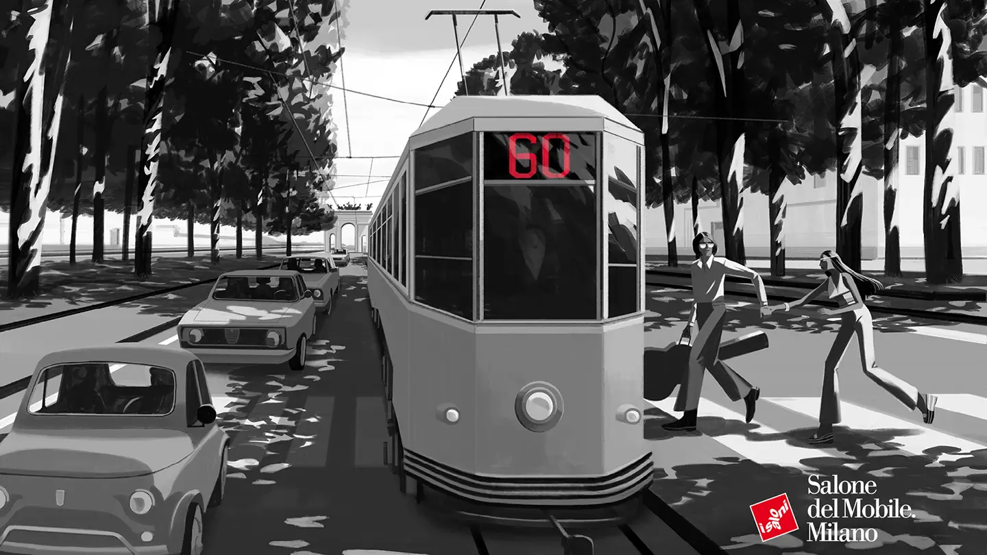
Not too complex, but really stimulating. The first thing I did was look for a common thread that would link the six posters together, not thematically but in terms of style and vocabulary, an element that would make them recognisably part of a single, harmonious body of work. A distinctive hallmark, basically, over and above the colour range that had been selected, the traditional Salone black and red, with the addition of white and the respective gradations. The idea I had, and I think it went down well, was to incorporate the number 60 into each of the images, interpreting it differently and making it an integral part of each design. On an aesthetic level, I wanted to come up with a communication campaign that was impactful, capable of engendering that wow factor that only the Salone can produce. Then I wanted to put people at the centre – those who create and those who visit the fair, representing their essence – and the Milanese landmarks – the Duomo, the Velasca Tower, La Scala, the Fairgrounds, the tram … Then, last but not least, I tried to flesh out the great desire to be together that the Salone generates, not just business but also conviviality, fun and a shared passion.
How much of your personal relationship with the Salone has gone into these posters?
When you’re doing my job, a cross between art and craftsmanship, you have to have a strong identity capable of relating to other people, the client, in order to find a meeting point that makes everybody feel involved - and that also goes for the people looking at the posters. In this case, it’s not just people in Milan, but a national and international audience, which has to be seduced by the look, first and foremost, and then figure out the concept and feel as though they’re part of what’s being illustrated. It’s always important to leave some empty space in every design, not to fill it so full that there’s no room for free interpretation - because everyone projects something of themselves into them.
Were you worried about tackling a celebratory subject?
That was another fundamental aspect for me: it wasn’t a classic piece of work, but a chance to represent a major anniversary after the “dark” couple of pandemic-ridden years, a new point of departure. I really felt a huge sense of responsibility.
How did you feed your visual imagination?
To start off with, I did some pretty in-depth research into what had been done in past years so see if I should use the same tone of voice or try and do something completely different. While on one hand I felt that it was right to take a very different line, on the other I wanted to carry forward some of the elements, such as the red, black and white colours, to knit a fine yet robust thread connecting with what had been done before, precisely to respect the identity of the Salone. After my work on the references, I looked through the evolution of the customs and culture of this 60th anniversary and took a different path.
Can you tell us about the six posters?
I’ll tell you about the six concepts, then you can enjoy looking at the images. The first poster depicts a 1960s Milanese interior, which is why it’s in black and white, with the occasional flash of red, such as in the picture of the Velasca Tower and other glimpses of the city. The second depicts working-class Milan, which was built and grew in the 1970s, then swinging Milan, with its fashion, its parties, the somewhat Pop city of the 1980s – and, so in this case, the illustration is a riot of red in all its various shades. For the 1990s, I was inspired by La Scala and its relationship with the city and with the Salone, while for the first decade of 2000, I focused on the Fairgrounds, the space designed by Massimiliano Fuksas. The final poster, which concentrates on the present and looks to the future, is focused on sustainability, which is currently one of the priorities of the event.
Your creativity is also evidenced by the incorporation of augmented reality. What did this involve at a working and at an emotional level?
Thanks to the partnership with Alkanoids, the really interesting thing we were able to do with these posters was to add a new level of relatability and interaction between the illustration and the audience through augmented reality. By using the ARIA app to scan the QR code in each poster, the illustrations come to life, changing from a flat, static state to a moving one. Basically something occurs in each one that will astonish and excite the viewer. This was achieved through animation, so rather more complex that just a drawing, because it involves a great many more details. On an emotional level, it’s certainly gratifying and wonderful to see one’s own designs come to life.
How did the strapline Join the Design Wave work with your design concept?
The strapline and the illustration have to forge a dialogue and have points of contact. In this case the message carried by the words is powerful, but broad enough to encompass all the posters. That’s where its power, its function lies.
Publishing illustration vs publicity illustration. Where does your work for the Salone fall?
It belongs to neither and also to both. Publishing illustration is usually freer, there’s an ample artistic margin because one is illustrating subjects that are less commercial, whereas publicity illustration has to tie in closely with the product it is attempting to market and, if you like, you could say, to be more functional than beautiful. We’re not trying to sell anything with these posters - neither me nor the Salone - just to express a reality as best we can. That’s why I wasn’t “constrained” and there would have been no need for it anyway.
Is there any part of you, a personal tie to the Salone or a “personal message” embedded in these images?
My memories and my feelings, as a visitor and as a protagonist of the event when I had done work and created projects for exhibitors, have gone into them. But the wonderful and most personal thing in these illustrations are the design objects (lamps, chairs, console tables, furniture) that I conjured up but that couldn’t be “real” “actually existent” – they were figments of my imagination. An extra layer of originality, alongside the subject.
Courtesy Salone del Mobile.Milano
17 March 2022
Share