

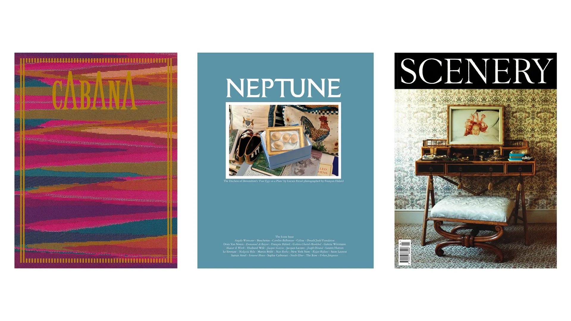
Cabana, Neptune and Scenery: three independent magazines that view the home not as a model to be imitated, but as a portrait of those who live there
Royal Cypher of King Charles III
From royal monograms to design company pictograms, how trademarks have changed and evolved over the years
As Mario Piazza says, the brand is “the tiniest particle but the most powerful personality disseminator.” Little wonder that logo design requires the utmost sensitivity. A coordinated image design encapsulates a subject’s identity and the era to which it belongs through a few simple graphic or typographic strokes. But given the speed today at which fashions, styles and even devices are evolving, logos can bear the brunt of the passage of time.
Very few logos have become “immortal” and made it into graphic design history; many could do with a redesign. Their transience, as we have recently seen, is related not only to time but succession. One example is the “logo” of the British Royal Monarchy, which, after the recent passing of Queen Elizabeth II had to be redesigned for King Charles III. The Queen’s historic monogram, widely visible throughout the United Kingdom, consists of Elizabeth’s initial, her ruling numeral “II” and R, which stands for Regina, Queen in Latin. The cipher is surmounted by the crown of St. Edward, which was made for King Charles II in the 17th century.
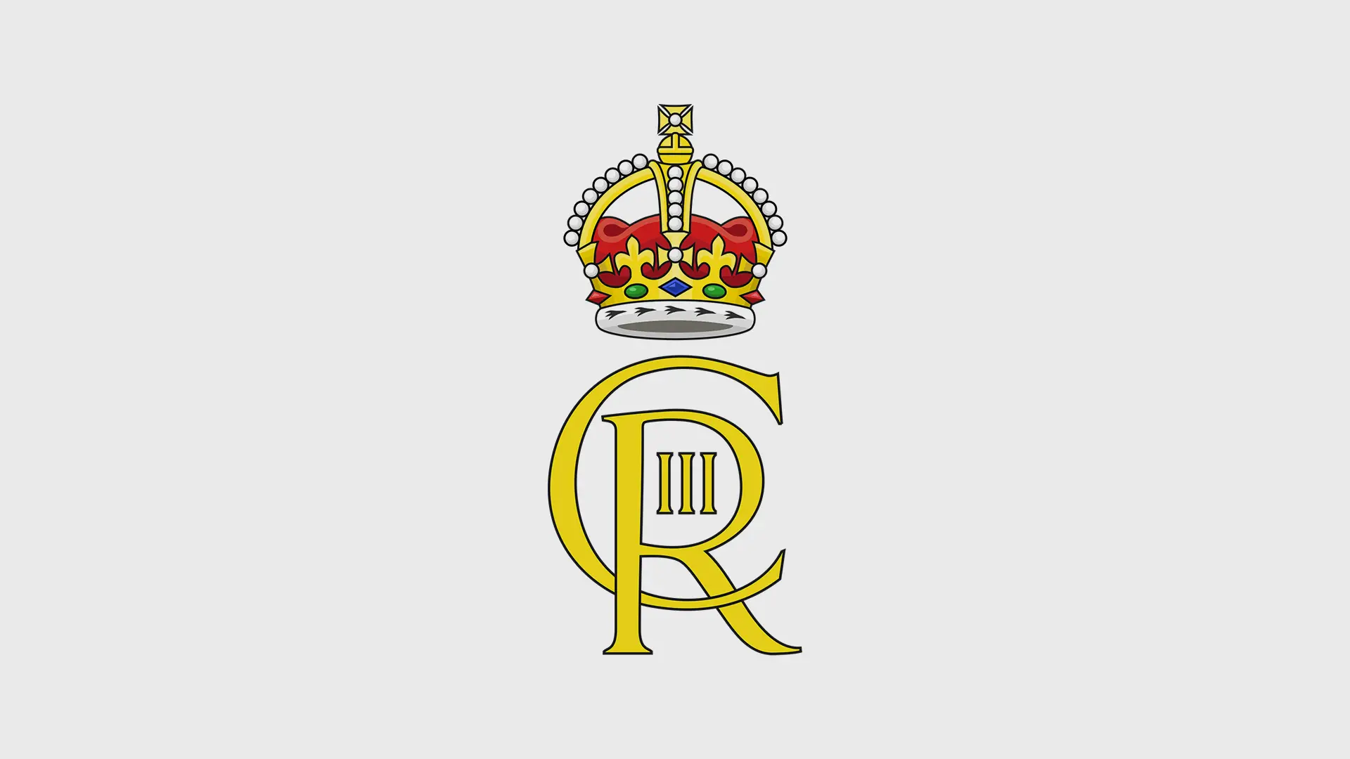
Besides intertwining the letters C and R, the big difference for King Charles III’s new monogram, designed by the College of Arms, is the somewhat obsolete graphic stratagem of the number III enclosed within the R (Rex) and the choice of the Tudor crown. Experts interpret this crown as a tribute to his grandfather King George VI, whose monogram featured the same item. Another major innovation is the double version of the Scottish crown monogram, approved by Lord Lyon, King of Arms.
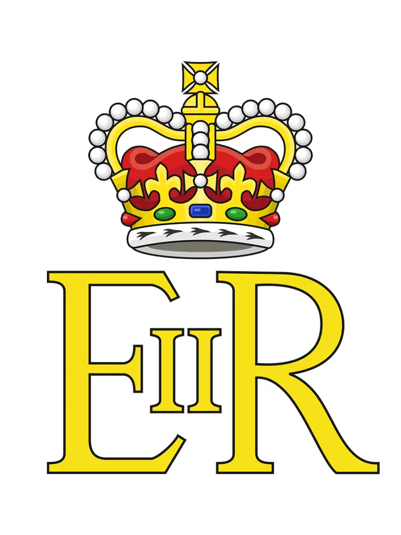
Royal Cypher of Queen Elizabeth II
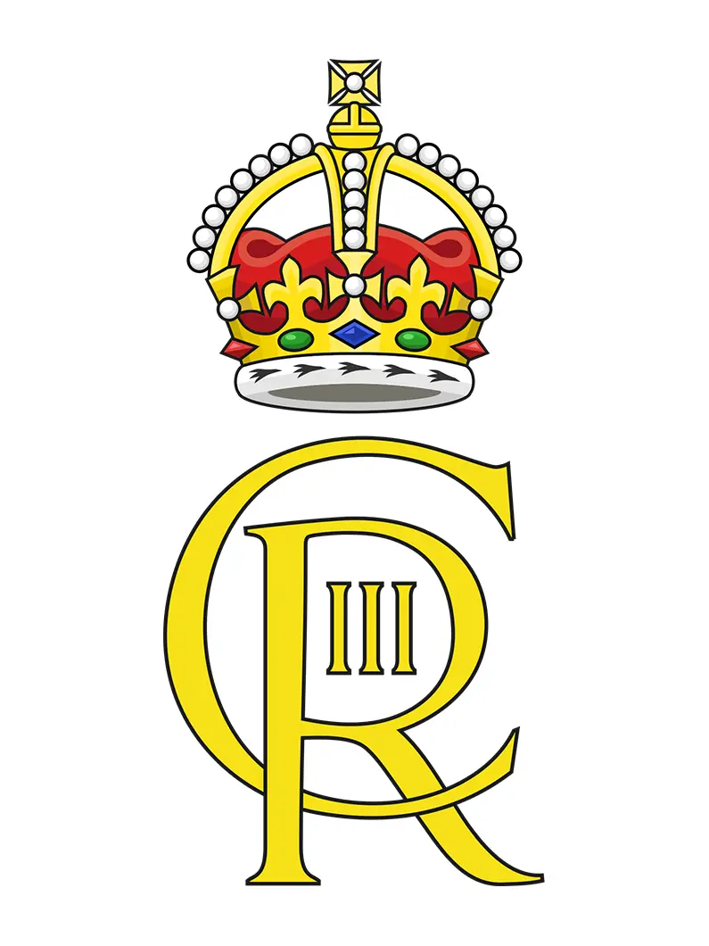
Royal Cypher of King Charles III
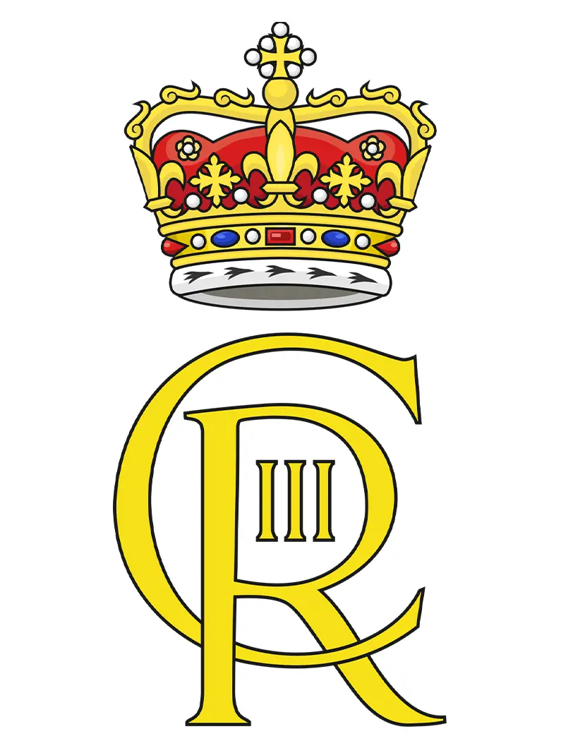
Royal Cypher of King Charles III (Scotland)
If institutional logos must follow strict diktats, design logos offer greater latitude for graphic experimentation. Design companies’ brands and how they have changed over the years reveal the history of graphic design and the corporate era they reflect.
One example is the iconic U.S. Knoll company. Its first logo, dating back to 1947, was designed by Herbert Matter, in charge of corporate identity from 1946 to 1966. The logotype consisted of an elongated serif font from which the letter K was extrapolated and, for typographical brevity, inserted into a circle.
In 1967, Massimo and Lella Vignelli took over the brief. At first, they retained the circled K mark flanked by the text “Knoll International” in Helvetica, before in the early 1970s gradually removing it. Vignelli’s sans serif logo in Helvetica became the company’s official image to commemorate Knoll’s 1972 retrospective at the Louvre. Thanks in part to the use of a timeless font, the logotype has remained unchanged ever since.
Knoll logo, design Massimo and Lella Vignelli, 1967, ph. courtesy
The graphic history of Arflex, a historic Italian company founded in 1950 by three former Pirelli technicians experimenting with foam rubber to make furniture, has gone through a number of different logos. Designed by Albe Steiner in 1956, the original dotted font logo proved to be ineffective, and ended up being changed several times over the years.
Evidence that the later logos were no more successful than their predecessors may be gleaned from the fact that little trace and information has survived about their look or who designed them. Arflex didn’t alight on its definitive logo until 1965, but it was worth the wait. Designed by the famous Bob Noorda, to whom we owe most of the trademarks still in use today, the simple red sans serif font continues to shine.
Arflex logo, design Albe Steiner, 1956, ph. courtesy
The recent (2021) restyling of the logo of Acerbis, an Italian company with a 150-year history, shows how a contemporary logotype can be a natural evolution of the past. Studio Temp, which oversaw the project, started with archive research, studying what changes the logo had gone through over the years. Discovery of an old “ab” monogram offering the starting point for the design. Reconstruction of this pictograph began from the ABC Maxi font, designed by Studio Dinamo Typefaces, which is itself an evolution of a historic optophonetic typeface created by Max Bill in the 1970s. Studio Temp revised the original monogram of the letter A in the ABC Maxi typeface to use as Acerbis’ pictogram, either alongside the full corporate name or solo.
Acerbis logo, design Studio Temp, 2021, ph. courtesy
Optophonetic font, design Max Bill, ph. courtesy
ABC Maxi font, design Studio Dinamo, ph. courtesy
The former metalmobil brand that in 2019 became Et al is another renowned example of a rebrand as a company seeks to reposition itself, in this case staking a claim in the design world through “design originality”.
Leonardo Sonnoli and Irene Bacchi (Studio Sonnoli) designed a new logo from the old name metalmobil, picking out and isolating the syllables “et al” within the word (in Latin, et alii means “and others”, a seemingly simple choice that encapsulates a graphic insight and a new attribution of meaning). The company creates new value specifically through “others”, co-authoring and enriching by working together and knowledge sharing.
Et al.’s rebrand impressed the international jury at the XXVII ADI Compasso d’Oro Award so much that it earned the company an Honorable Mention.
Et al. logo, design Studio Sonnoli, 2019, ph. courtesy
Metalmobil logo, ph. courtesy
Rebranding, Studio Sonnoli, 2019, ph. courtesy