Before him, the object counted more than the designer. As of 1984, the designer has become the object. The story of a career built on image, and the objects that contradict it
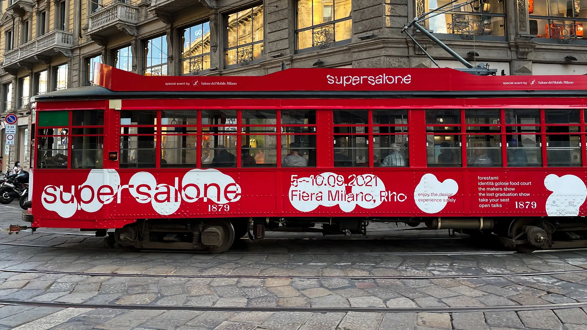
Creators of the visual identity of this special event by Salone del Mobile.Milano, Studio Folder explains why this is important and how it could inspire others
You’ve been working together as Studio Folder, Agency for Visual Research, since 2011. Your projects are distinguished by their great interdisciplinary character (science, technology, geography …). How did this approach to communication come into being?
As a studio working with design we are always driven by a powerful curiosity about other disciplinary fields, in the belief that visual design is first and foremost an exercise in (re-)organising knowledge, rather than a stand-alone discipline or a profession. Over the years, exploring this practice through the projects we’ve worked on, we have always sought out collaborators with different training and skills, order to keep testing and redefining the ways and structures with which a studio can operate.
Even the name of the studio, Folder, draws on this method. How did it come about?
The word Folder has various different meanings that relate to each other: the root derives from the verb to fold, which we mean as the act of turning a two-dimensional surface into a three-dimensional structure. This immediately seemed like a good metaphor for describing work that aspires to bring order and complexity to something that would otherwise be flat, without variations. The most literal meaning of the English word folder can translate into Italian as “raccoglitore,” or binder. In this sense it chimes with what we do: observing, selecting and classifying reality. For us design is a task that always redefines the content and the methods of communication, creating new codes and indices for the transmission of knowledge. In parallel with this, we have developed an interest in design tools, from the conceptual ones to the material ones, which informs the attention to technology and production policies and information manipulation in our work.
On the basis of this, how do you tackle your projects?
Our work always begins with a visual reconnoitre with a strong historical component. This enables us to create a reference system for the different aspects of a theme and its connections with the modern day. The enormous availability and accessibility of online archives of various sorts is a crucial resource in terms of exploring analogies, cross-references and cross-contaminations between different ideas and media: often our design proposals stem from highlighting these hidden connections.
Your design sensitivity chimes closely with the concept underpinning this supersalone, how did the collaboration start? Can you give me an example of the design choices you mentioned previously?
Stefano Boeri involved us in the project in medias res. We had previously worked with him at the 2014 Architecture Biennale, curated by Rem Koolhaas, where we were carrying out a number of functions, including that of art directors of the Tomorrow, a digital platform conceived like a modern “Republic of Letters.”
We believe that this supersalone has a chance to redefine some aspects of an event, the scale and importance of which bring about huge responsibility in terms of issues surrounding the economy, accessibility and sustainability of design. In this sense, we tried to make sure that the communication project fostered some good practices with regard to the reuse and circularity of materials. One such example is the decision not to intervene graphically on many of the surfaces of the Milan Fairground displays, in order to encourage the reuse of thousands of square metres of fabric and help lessen the environmental impact of the event.
How did the concept for the identity of supersalone come about?
We were first inspired by photographic and archive research into expressions of some of the key values of the curatorial project, especially those linked to participation and the idea of discovering something new. One of our first references was the Dot Pattern by Ray Eames, a motif probably generated by the shadow of one of the chairs in his studio, which references the geometry of the object but which, when decontextualised, takes on a wider meaning and can turn into a language. We then tried to set up a formal dialogue between two-dimensional graphic motifs and various architectural elements that characterise the elevations of the display modules.
The design for the logo started with choosing a font from the digital foundry Florian Karsten Typefaces—FK Display, run by Květoslav Bartoš - which we changed by altering some of the letters and integrating a system of geometrically dynamic voids and solids in order to create a fluid identity.
What were the most important aspects of the planning?
It’s a large-scale project, so we tried to come up with a simple idea and some rules that would allow us to tackle the large volume of artwork we had to produce. The entire communication system is based on a very limited system of basic shapes, and a series of permutations that allowed us to generate a huge number of variants.
The result is an identity that we believe to be extremely recognisable, but which can also adapt to very different scales and formats – both printed and digital. We then discussed a number of concrete design choices with the supersalone team, especially around the treatment of the materials, exploring the ecological and financial implications. Generally speaking there’s a desire to contribute to a project that could have a lot of potential, not just for Milan, but as a benchmark for all the sectoral events.
What do you think about this supersalone?
We are happy to have had an opportunity to take part in designing such a complex event, which chimes with the interests and expectations of so many design professionals. Now we are just waiting to see the final outcome and how it’s received.
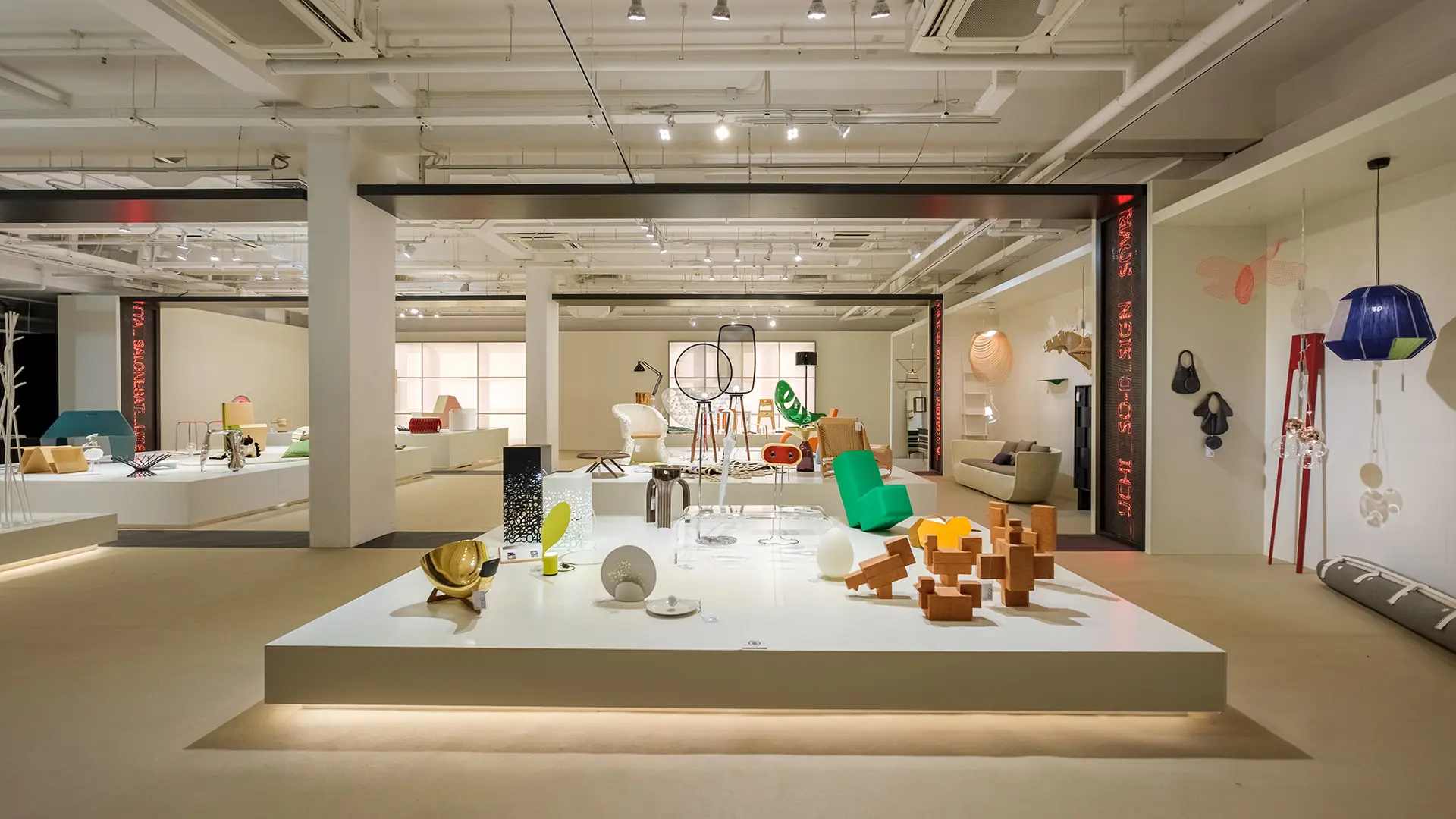
We believe that the mixture and co-presence of companies, schools and open talks in one single space will create a platform for the exchange of ideas on design products and product economy, not usually part of a largely commercial event. In this respect, supersalone is radically different to previous editions of the Salone, aiming to provide a rather more open and horizontal overview of the current design scene. This format could make for a fair whose responsibility towards the current environmental emergency is clear: the large amount of resources, materials and energy being poured into such a short event by an industry that should be tackling the question of respect for and optimisation of the planet’s resources first and foremost, is a fundamentally critical issue.
The decision to open the pavilions to the public for the entire duration of the event and to present products and work by students, emerging designers and independent makers and workshops alongside the best-known brands and companies is undoubtedly one of the strongest points of this curation. The layout is more like an exhibition than a fair – showcasing a large range of different products without the intervention of large aspiration and status-boosting temporary structures – and has the power to redefine some of the value and market equilibrium that has dominated the design world.
4 September 2021
Share


Road to Salone 2027: the SaloneSatellite Permanent Collection makes its debut in Jakarta
Indonesia will be the first stop on the Salone global tour: from 18th September to 18th October 2026, at Indonesia Design Week, the SaloneSatellite Permanent Collection will showcase 27 years of talent, enterprise and the future of design

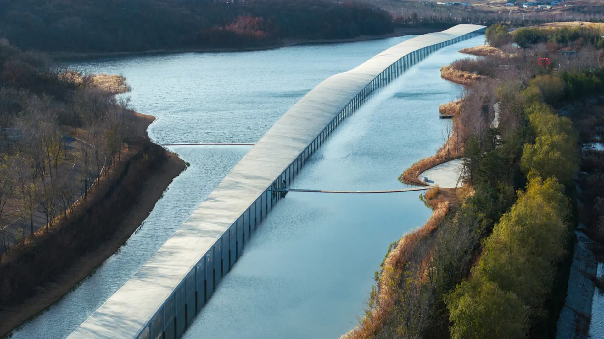
Architecture on the water: 10 projects to discover
Some buildings gaze at the water from above, others allow it inside; still others descend beneath it, and there are even those that float on it all through the summer. Ten buildings, from 1935 to the present, tell the story of the many ways design engages with an element that is never still
