


Everything you need to know about the 64th edition: dates, times, tickets, the return of EuroCucina / FTK – Technology For the Kitchen. And then the International Bathroom Exhibition, and the absolute novelties such as Salone Raritas, Salone Contract and the installation “Aurea, an Architectural Fiction”
From patents to green architecture. Summer books to surprise and entertain us
Text by

What better time than the summer to dip into a good book? We’ve trawled through the mass of new and old editions and come up with some titles that seemed particularly intriguing!
“Diffused light, splendour. Summer is essential and forces every soul to happiness,” said André Gide. The happiness, too, of reading a book, because summer is synonymous with relaxation, rest, reflection and free time. Happy reading!
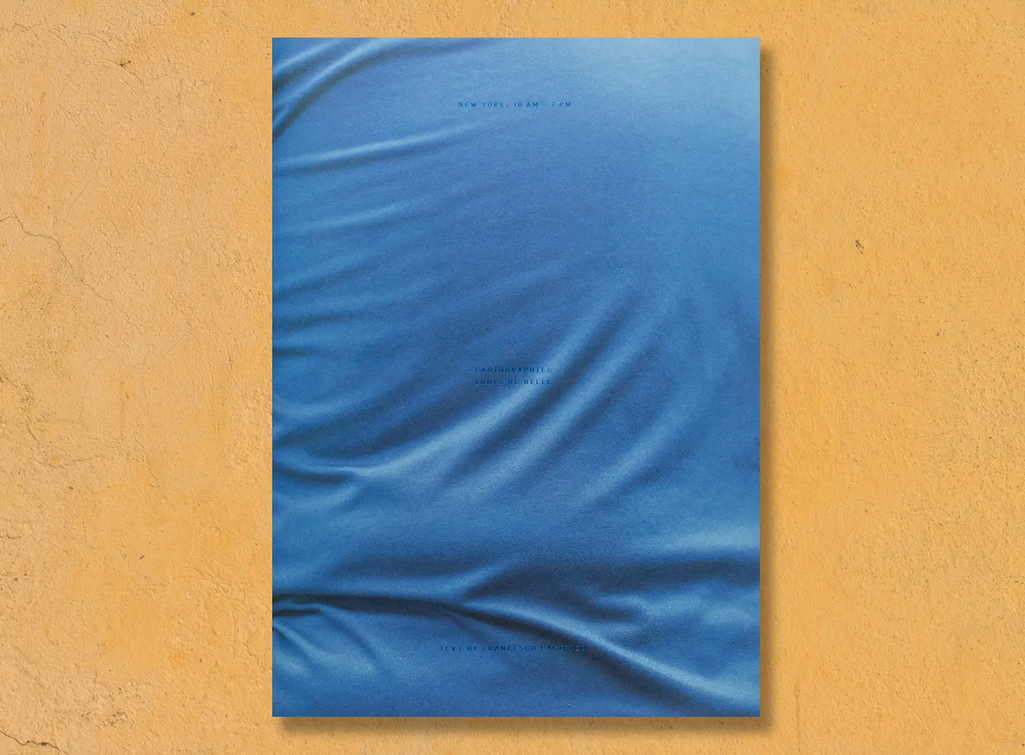
Cartographies: New York, 10am-7pm (Humboldt Books), a series of macro-photographic shots of the clothes of passers-by in the streets of Manhattan. They are snapshots of daily life, amid the folds and stains, cartographies of people’s journeys. Laid out in newspaper format, the pages bound with a rubber band, this small book alternates original photographs with details enlarged to take up a full page.
The central spread features a chronological index of the images, referencing the subtitle New York, 10 am–7 pm, indicating the precise time at which Louis De Belle (born in Milan 1988, with studios at the Milan Polytechnic and the Bauhaus - Universität Weimar) took the many photos. A memento vivere between the lines, on the repetitiveness of everyday actions. Fragments of Francesco Pacifico’s text, written within a New York setting, are scattered amongst the images.
For those who thought they knew New York like the back of their hands.
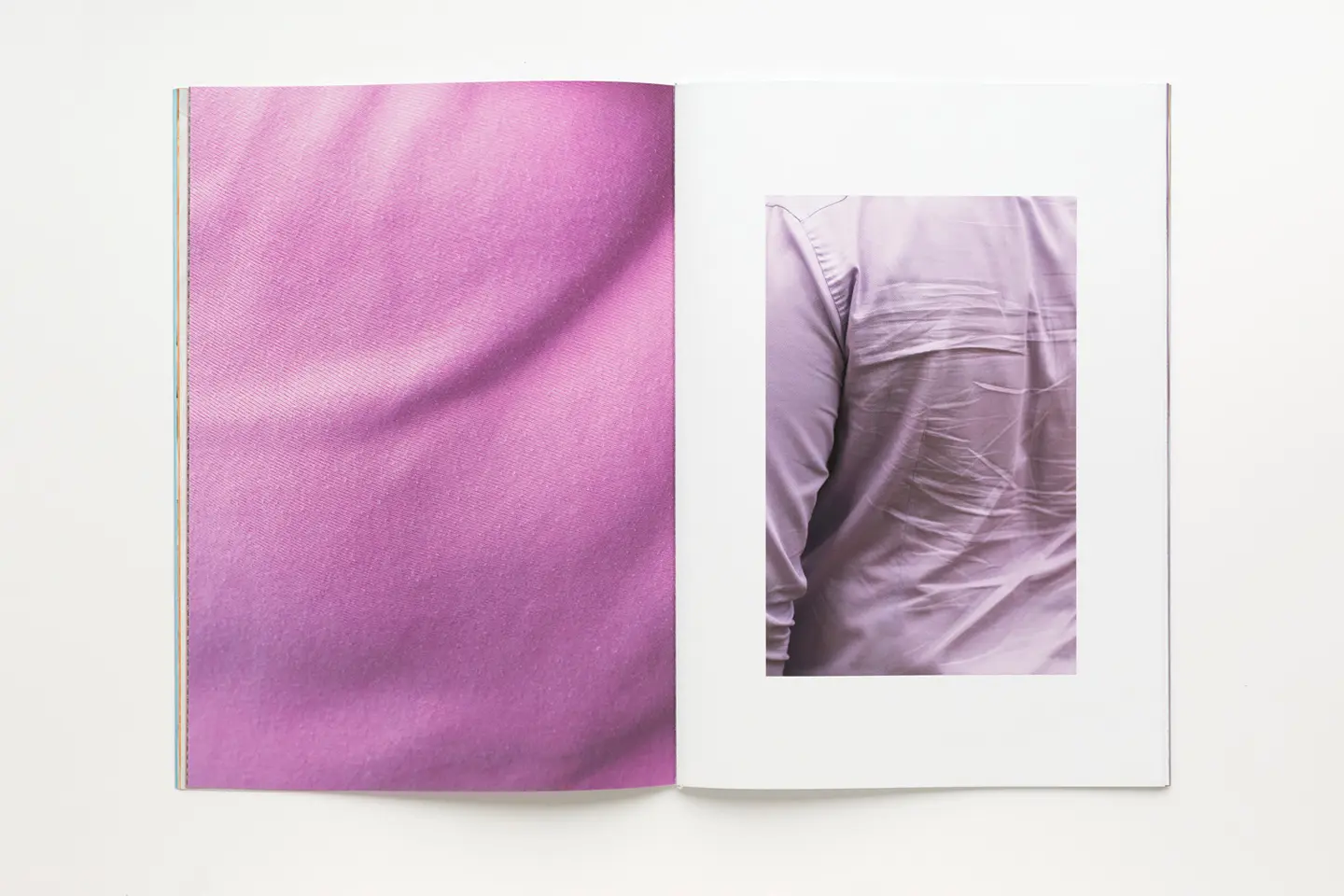
© Louis De Belle, Cartographies.
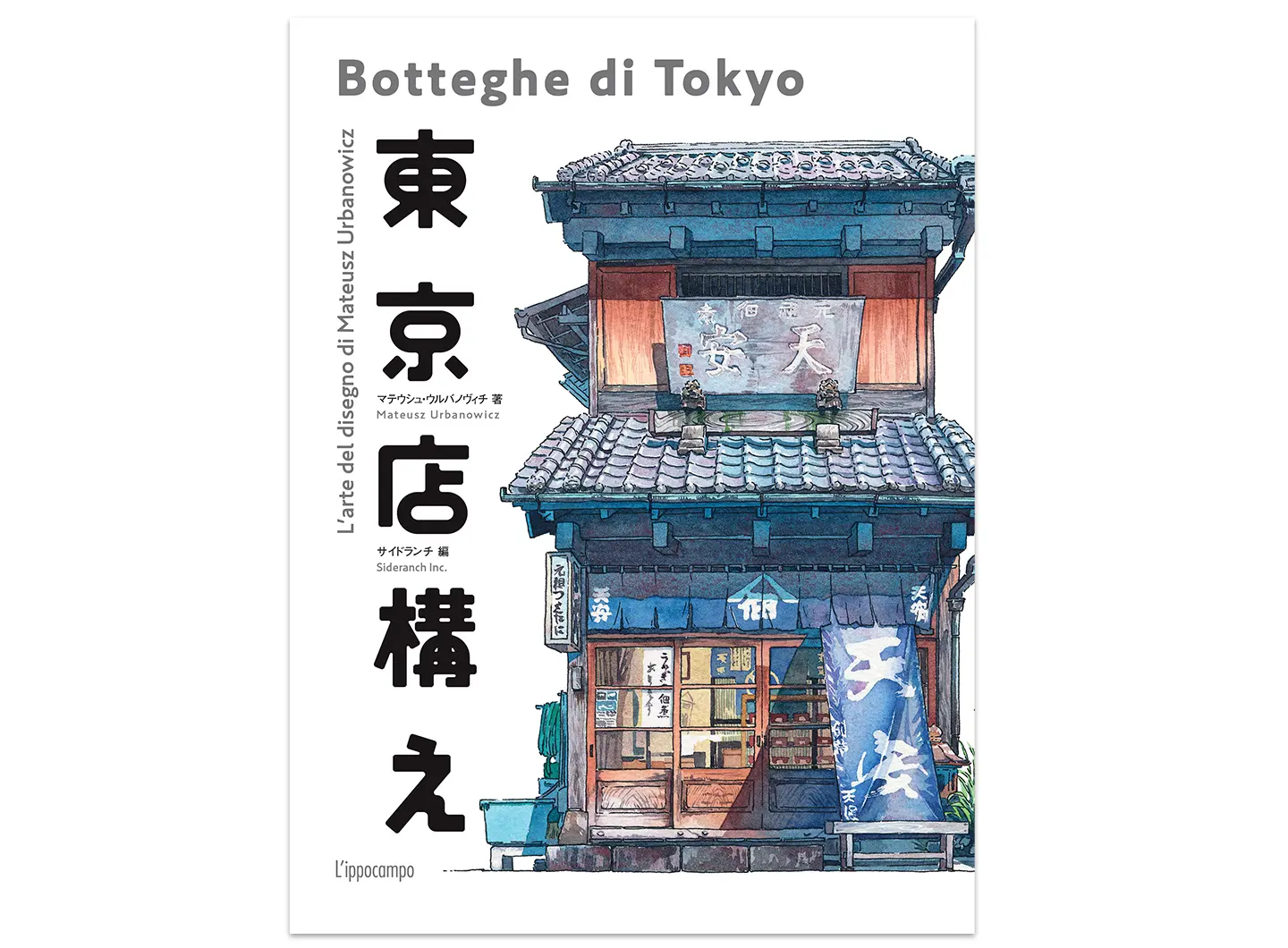
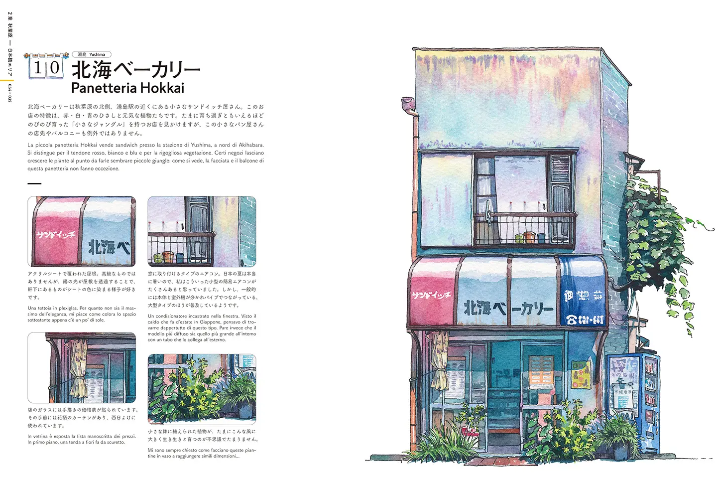
A book that has already become a benchmark guide for those nostalgic about the Tokyo of yore.
Illustrated by Mateusz Urbanowicz, Polish by birth, but resident in the Japanese capital for many years, with experience in cartoons, illustrations, animation and video, Botteghe di Tokyo [Tokyo Storefronts] (L’ippocampo) is a deliberate attempt to draw attention to these historic buildings, survivors of the vertiginous urbanisation of the city. A selection of shops, depicted in watercolour, “because they bring a particular colour and character to the streets of Tokyo.”
As we make our way through five different districts, among the more than 50 shops illustrated, are one that has been selling chiyogami papers, hand-painted with traditional Japanese motifs; a biscuit shop with stunning eaves; a Thirties tempura factory and the now-demolished Yamane butcher’s shop of the same period, famous even among tourists for its meat croquettes.
The perfect book for those nostalgic about times gone by.
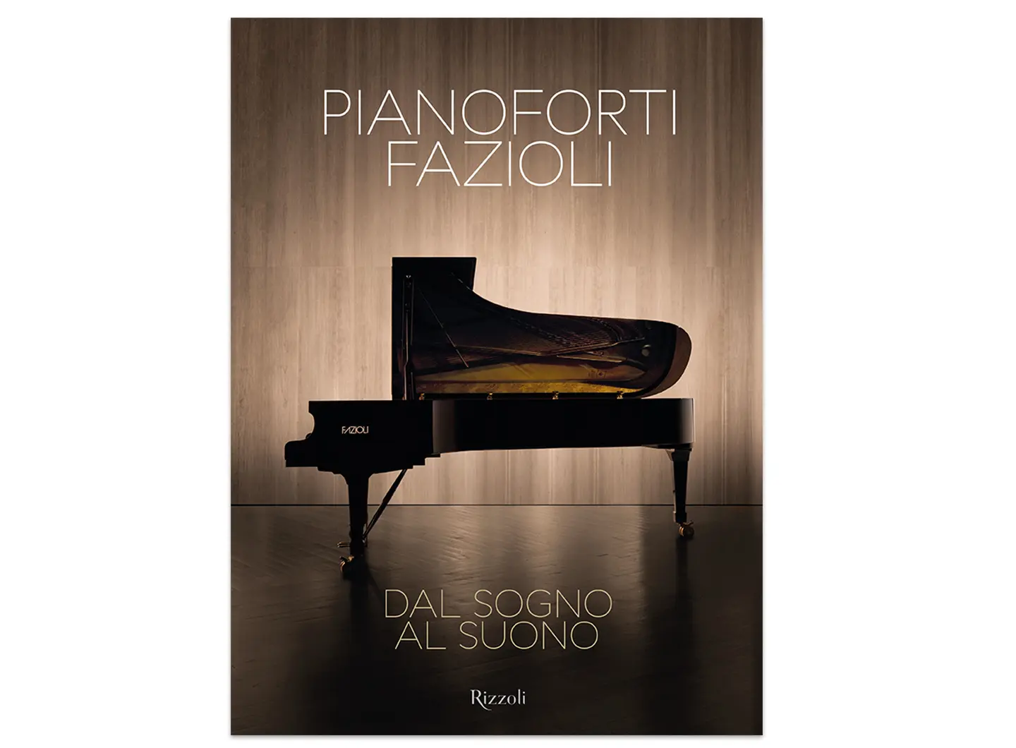
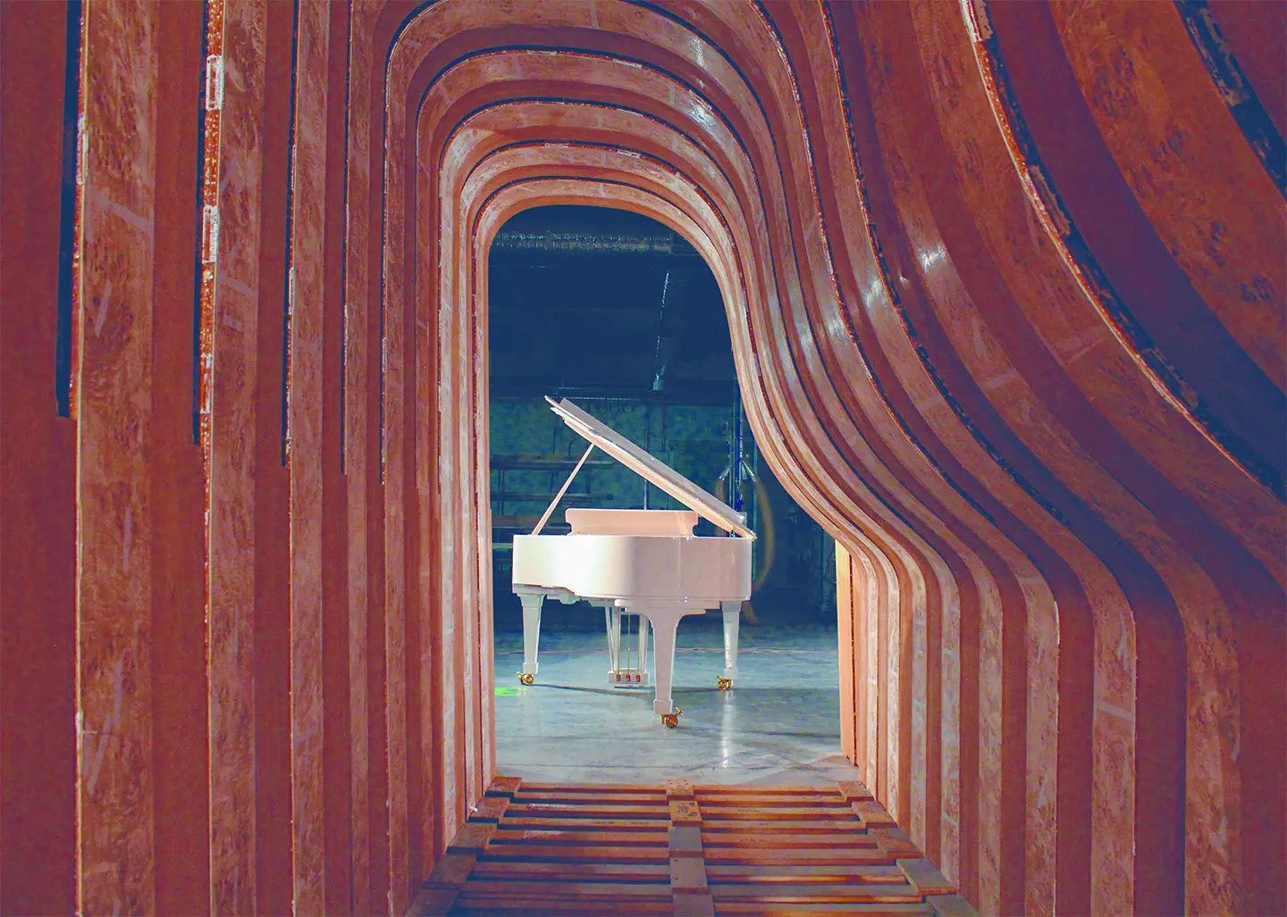
If it takes wood to make a table, the same goes for a piano. It was precisely on a sheet of plywood that at the age of ten, Paolo Fazioli, the creator of the company of the same name, drew 88 black and white keys so that he could play in his imagination.
As the title shows, Dal Sogno al Suono [From Dream to Sound] (Rizzoli), Fazioli has surpassed his own dream. As well as a diploma from the Conservatoire in Pescara, he has a degree in Engineering, a magic combination that has allowed him to encapsulate perfect sounds within the instrument. “Our dream had to be bright, cheerful, expressive, full of colour and powerful,” he says.
In other words, unlike the many other pianos that he had collected in order to study their sounds, just as he had done as a child, dismantling an old piano that he had found at home. His adventure began in the historic family furnishing business in Sacile, which numbered leading figures such as Fontana, Ponti, Mendini, Munari, Scarpa, Gregotti and Zanuso amongst its designers. Here, he carved out a space for his passion and drafted in all the right people – Pietro Righini, a musician and scholar of the physics of sound, Guglielmo Giordano, a wood technologist and founder of Italy’s CNR (National Research Council) National Timber Institute, and Lino Tiveron, an expert craftsman, and his son Pierluigi – and soon conquered the world with his excellent team.
The rest remains to be read (starting from the introduction by Herbie Hancock), seen and heard through the words of the great contemporary performers.
For those who love stories of entrepreneurship in Italy, from dream to happy reality.
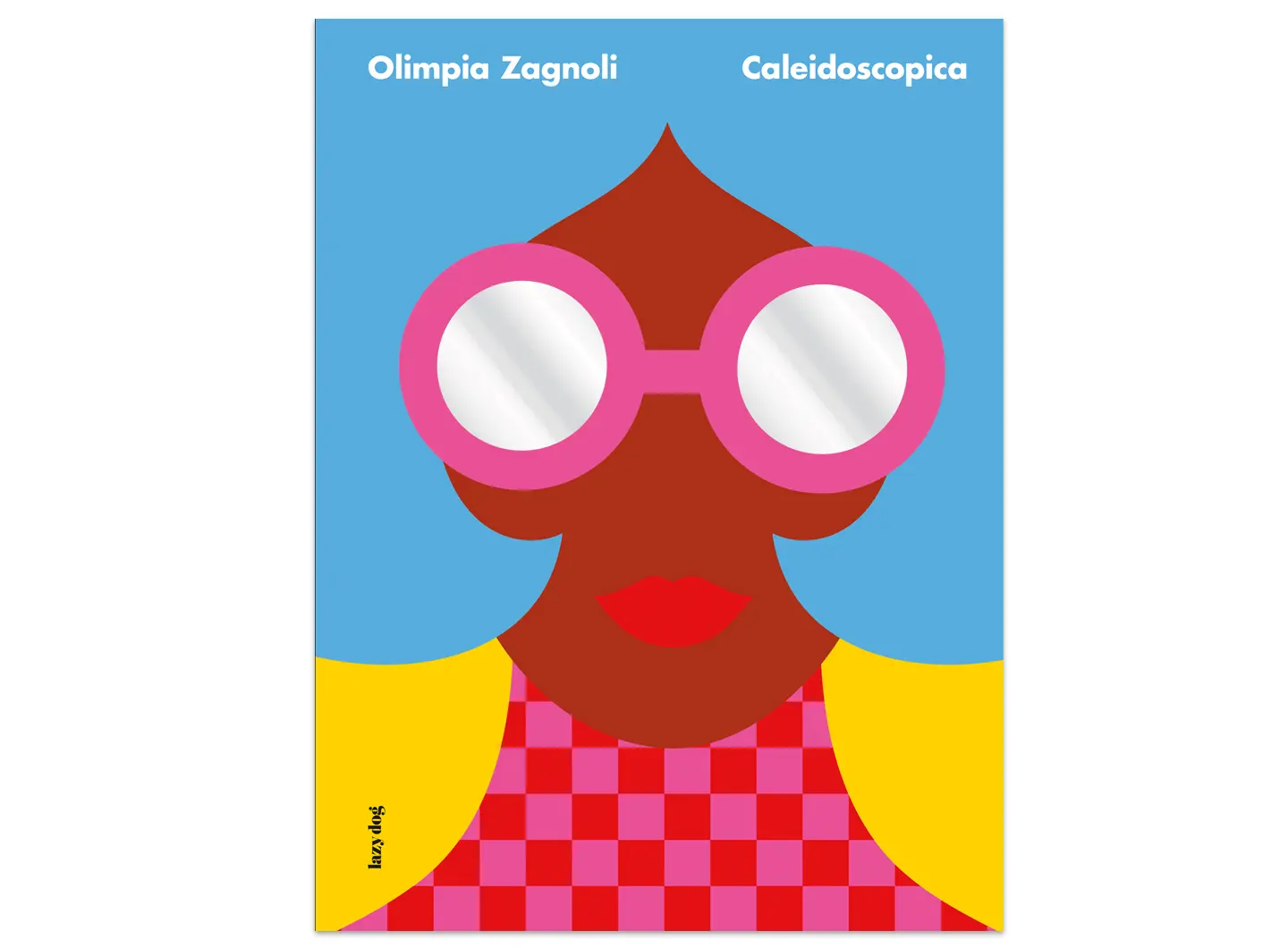
Brightly-coloured and jolly, like the summer, Olimpia Zagnoli Caleidoscopica (Lazy Dog Press) is an anthology of the artist’s work over the last ten years. She is one of the most interesting of the new generation of illustrators, and divides her time between publishing, fashion and communication.
Her soft, colourful work impregnated with deep colours – from her drawings to her prints, from neon to fabrics and sculptures – has been brought together by free association or similarity of subject, colour and form. A series of sketches gives insight into her creative process, her quest for synthesis and precision of image. Texts and thoughts of authors working in the world of illustration, design and art add original keys to her work.
The highly engaging paperboard cover features the mirrored glasses that characterise her own look, and to which Italo Lupi devoted an affectionate piece.
For lovers of design, fashion, style and seekers of infinite inspiration