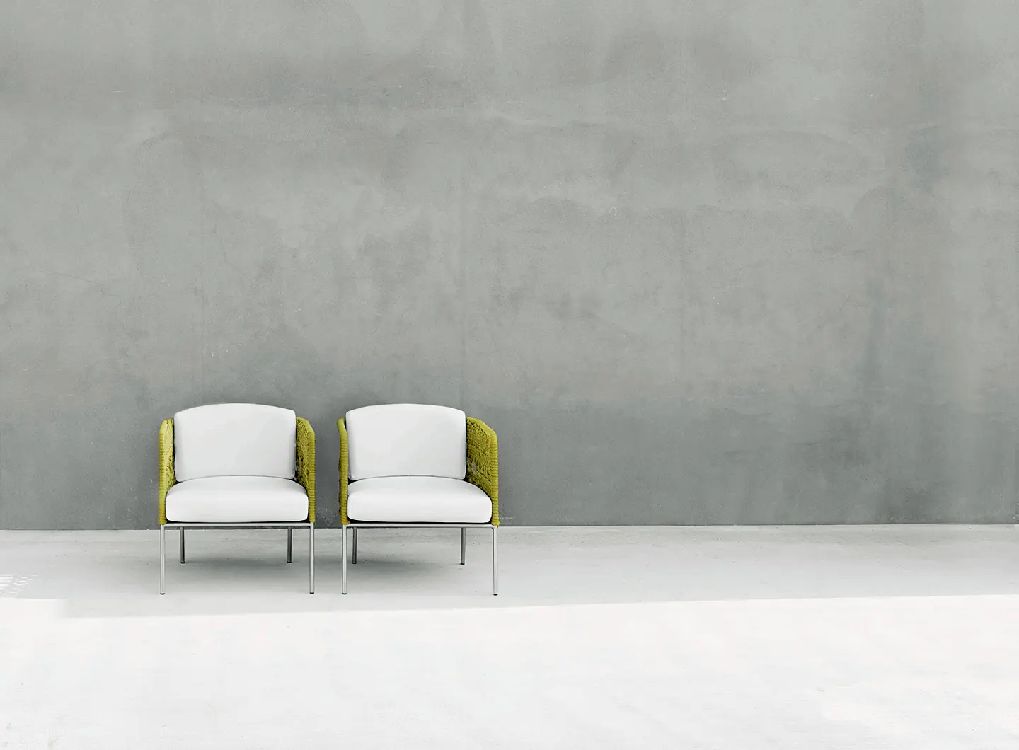
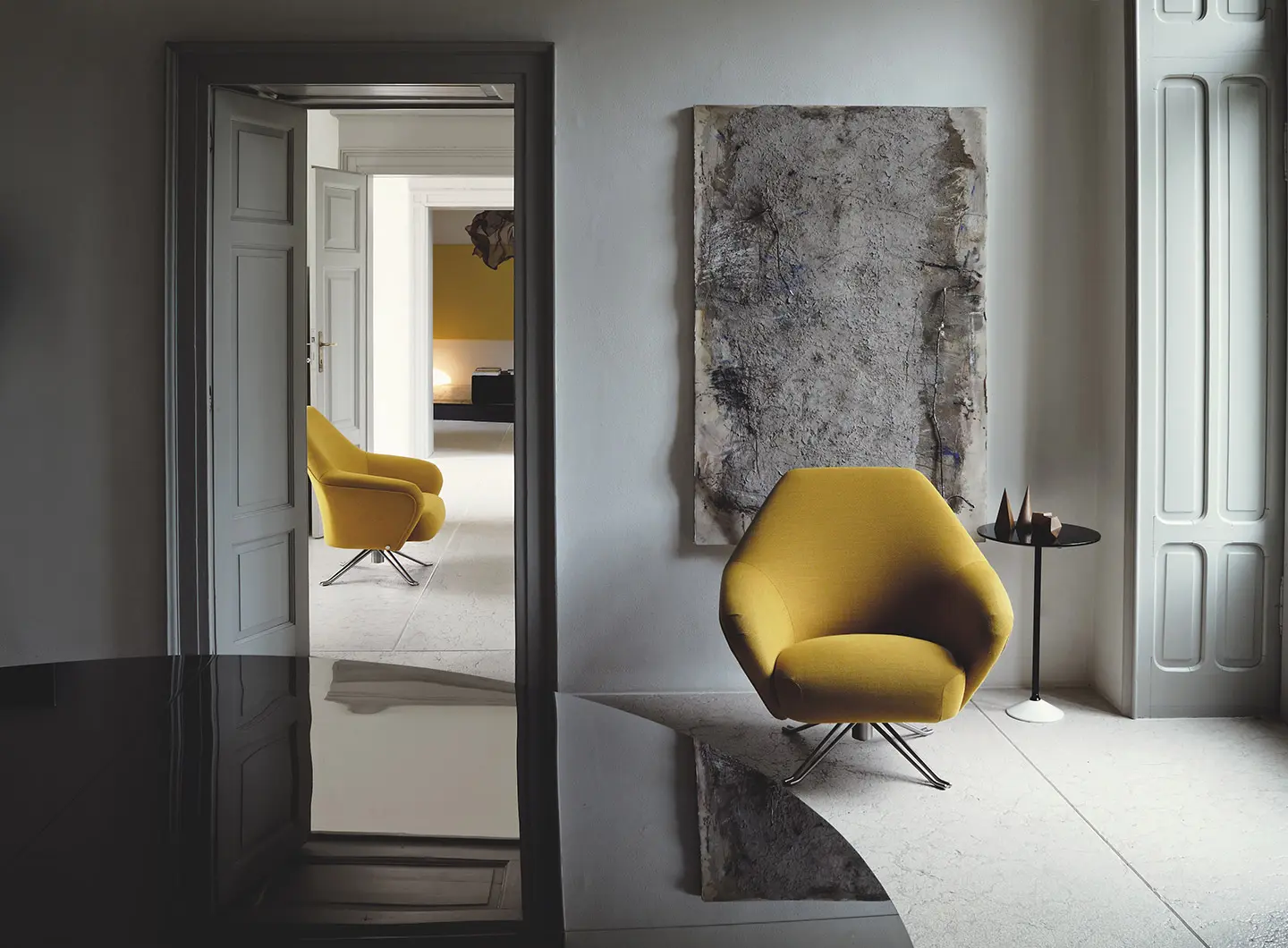
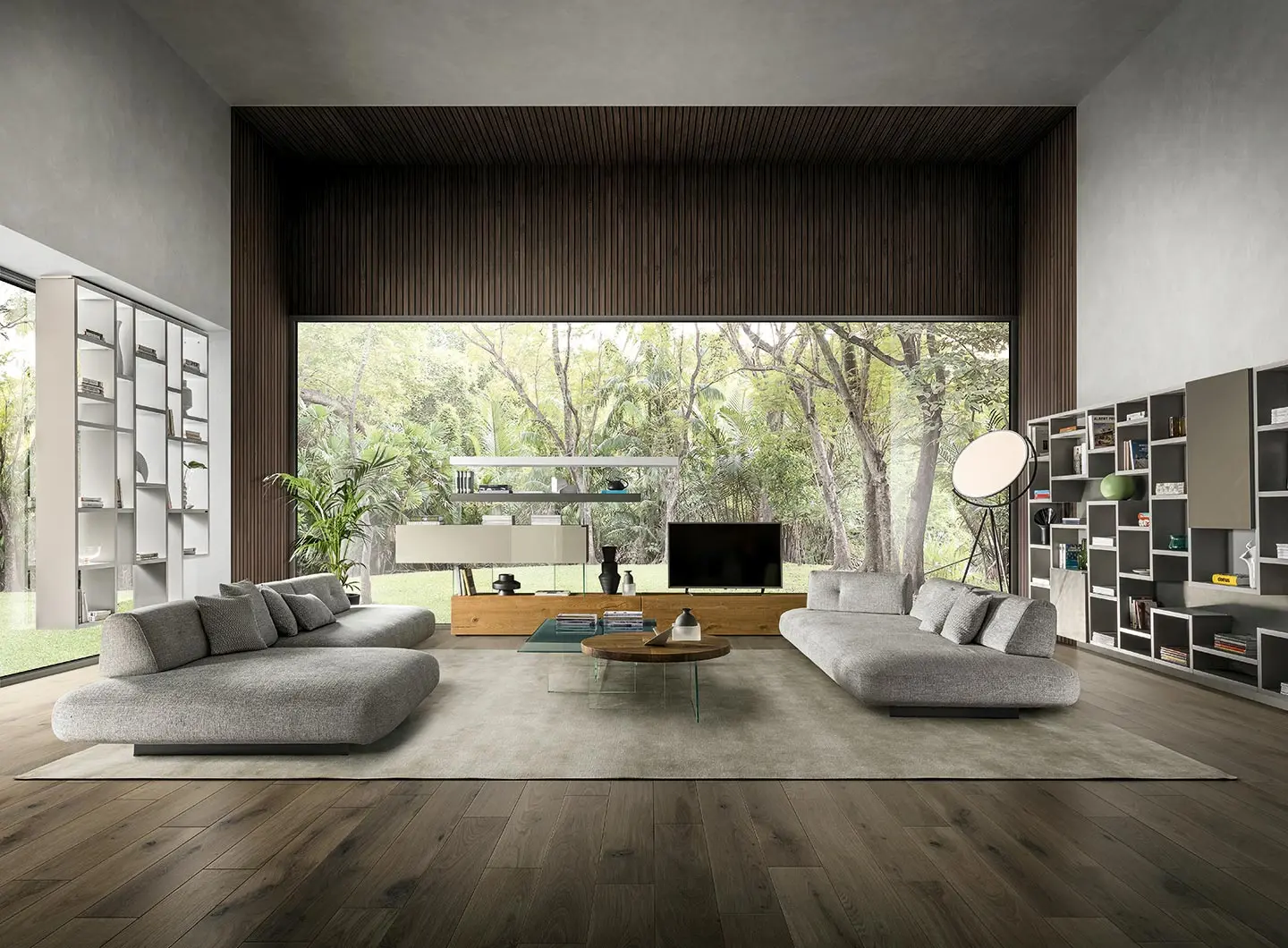
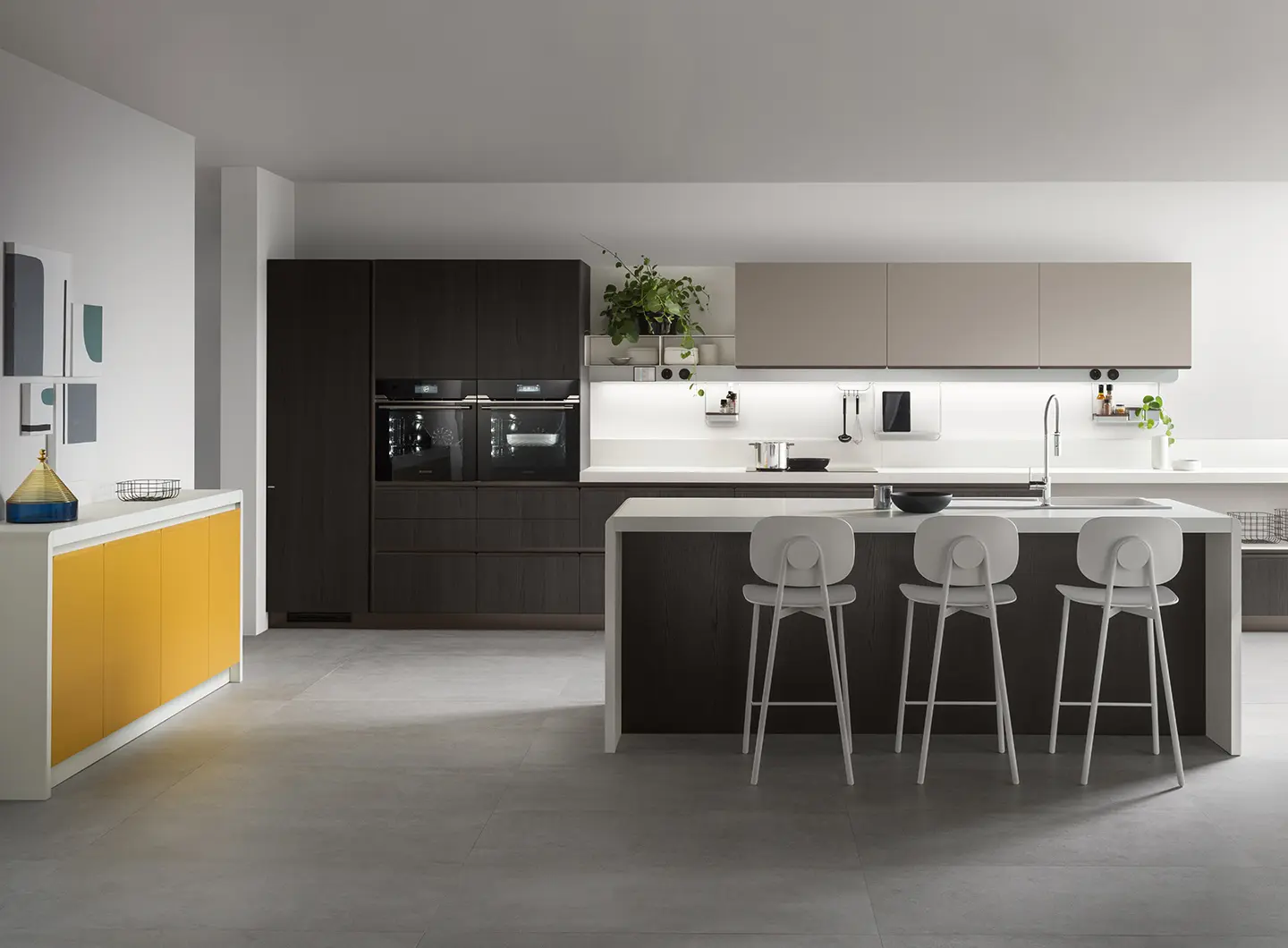
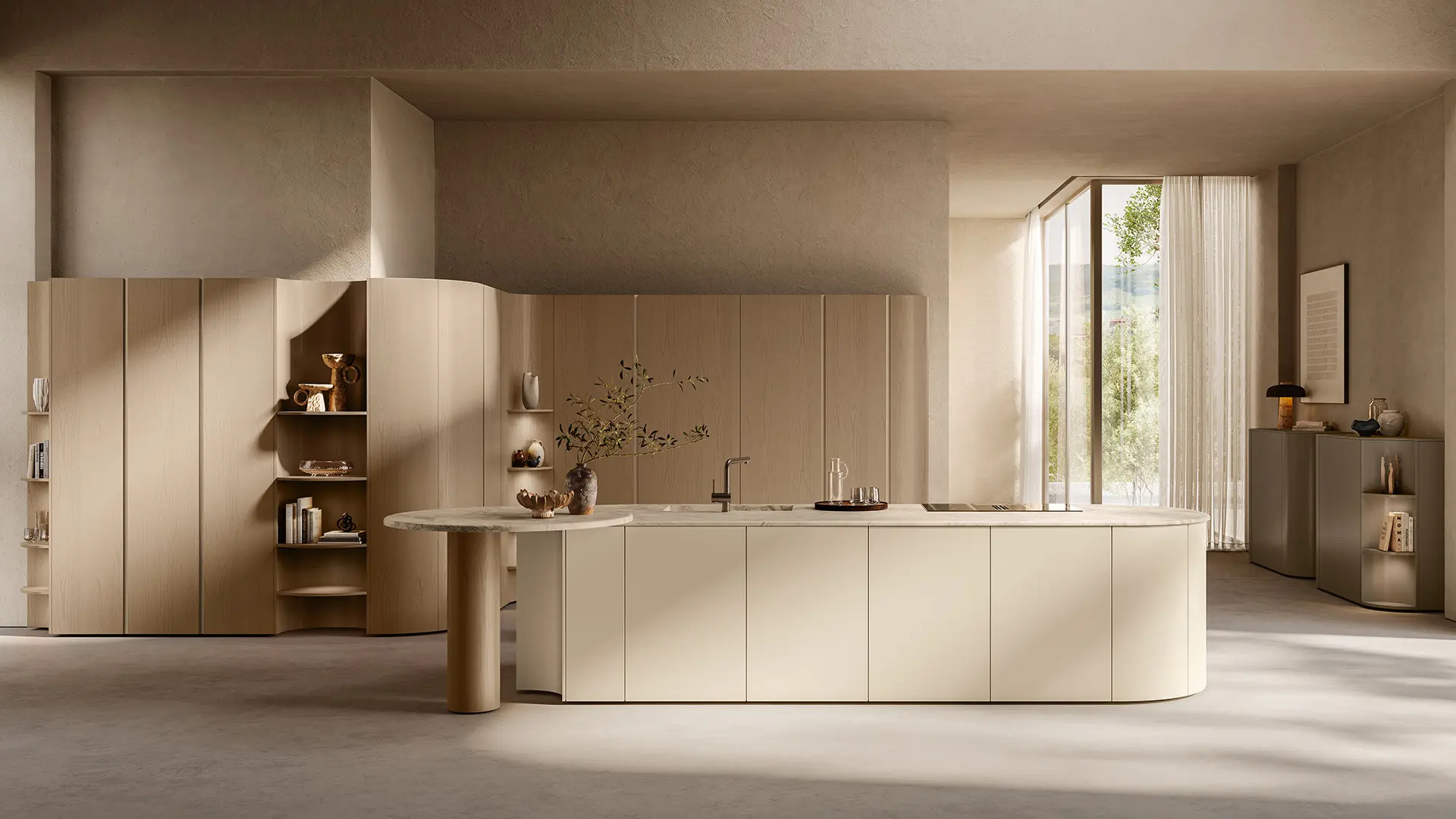
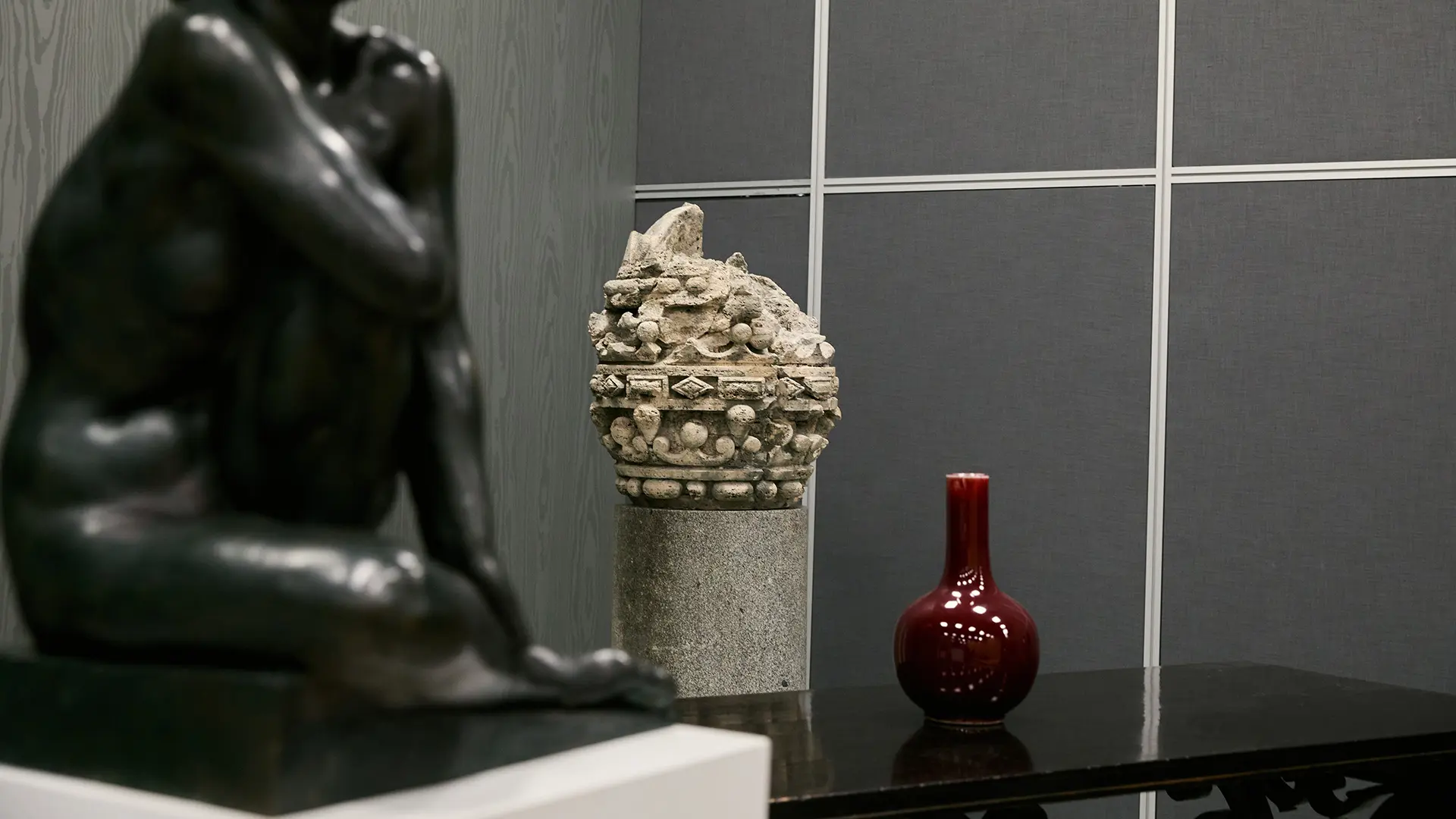
Nineteen Romanian furniture brands gathered under the Romanian Furniture – Together for Future brand, presenting new and distinctive collections. Keywords? Natural, sustainability, customization and flexibility
Ultimate Gray & Illuminating, the new 2021 color storytelling
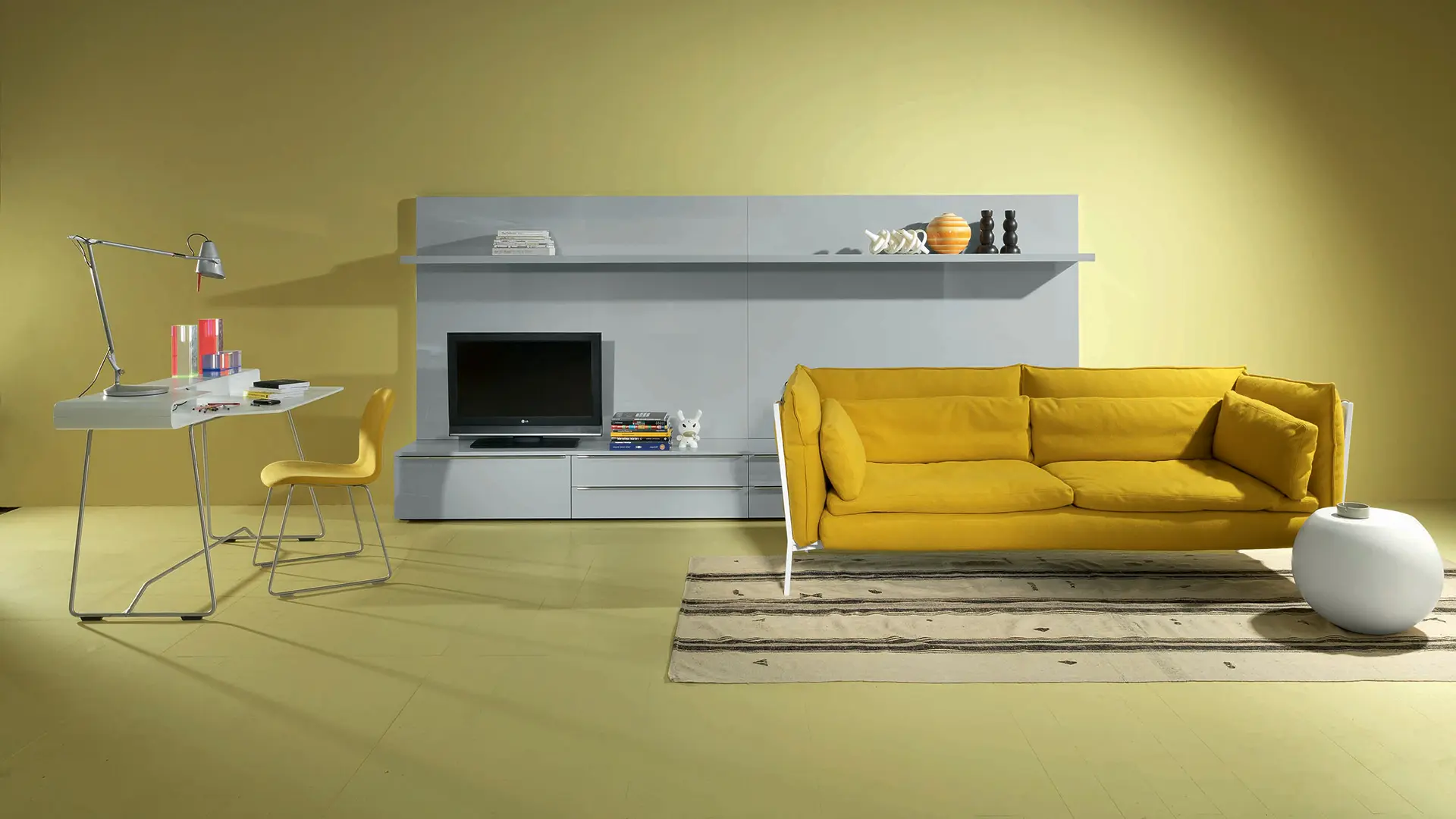
Cappellini
An optimistic and versatile palette that speaks of creative energy (yellow) without forgetting sobriety (gray)
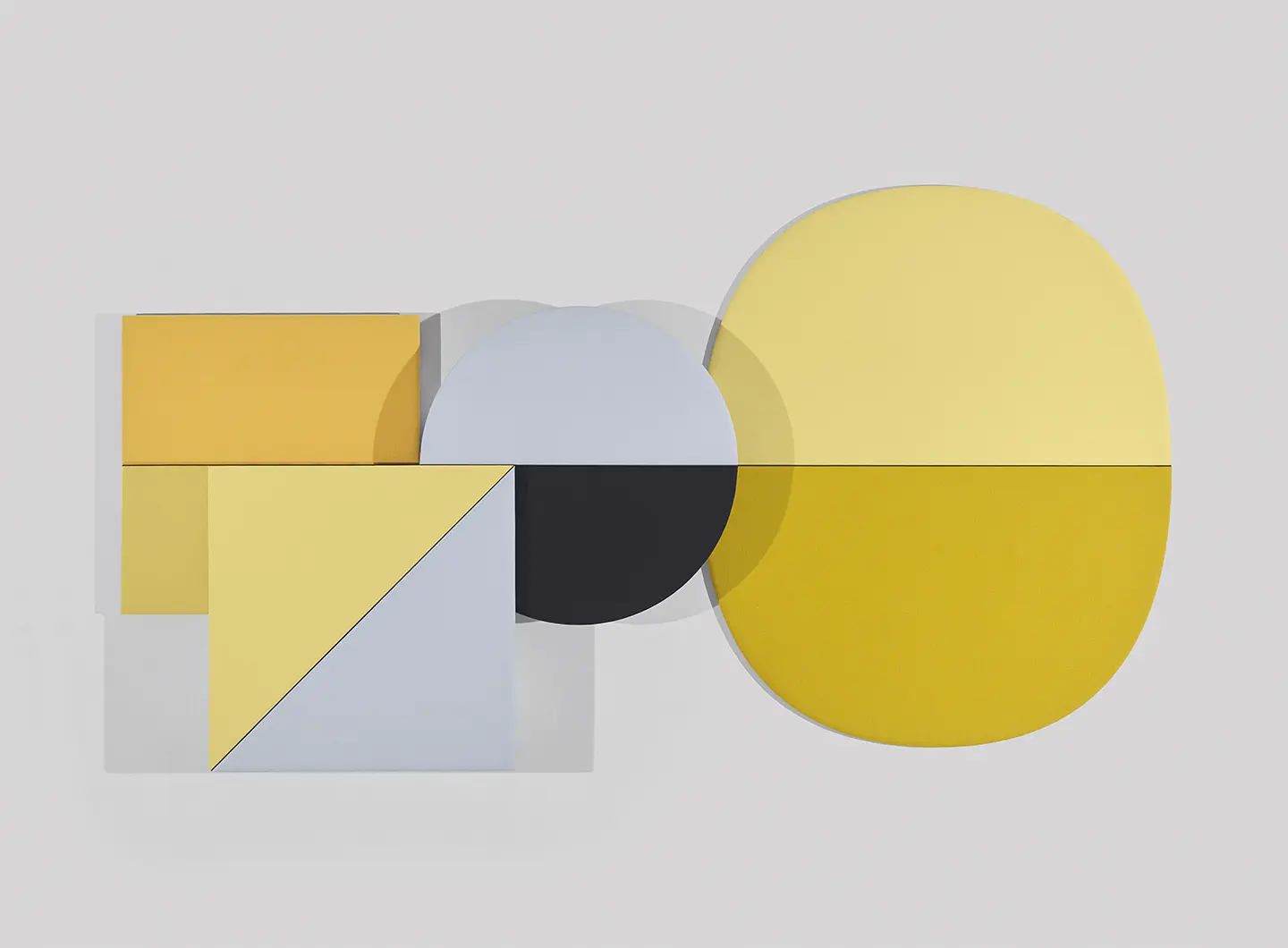
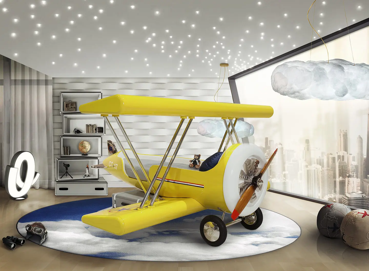
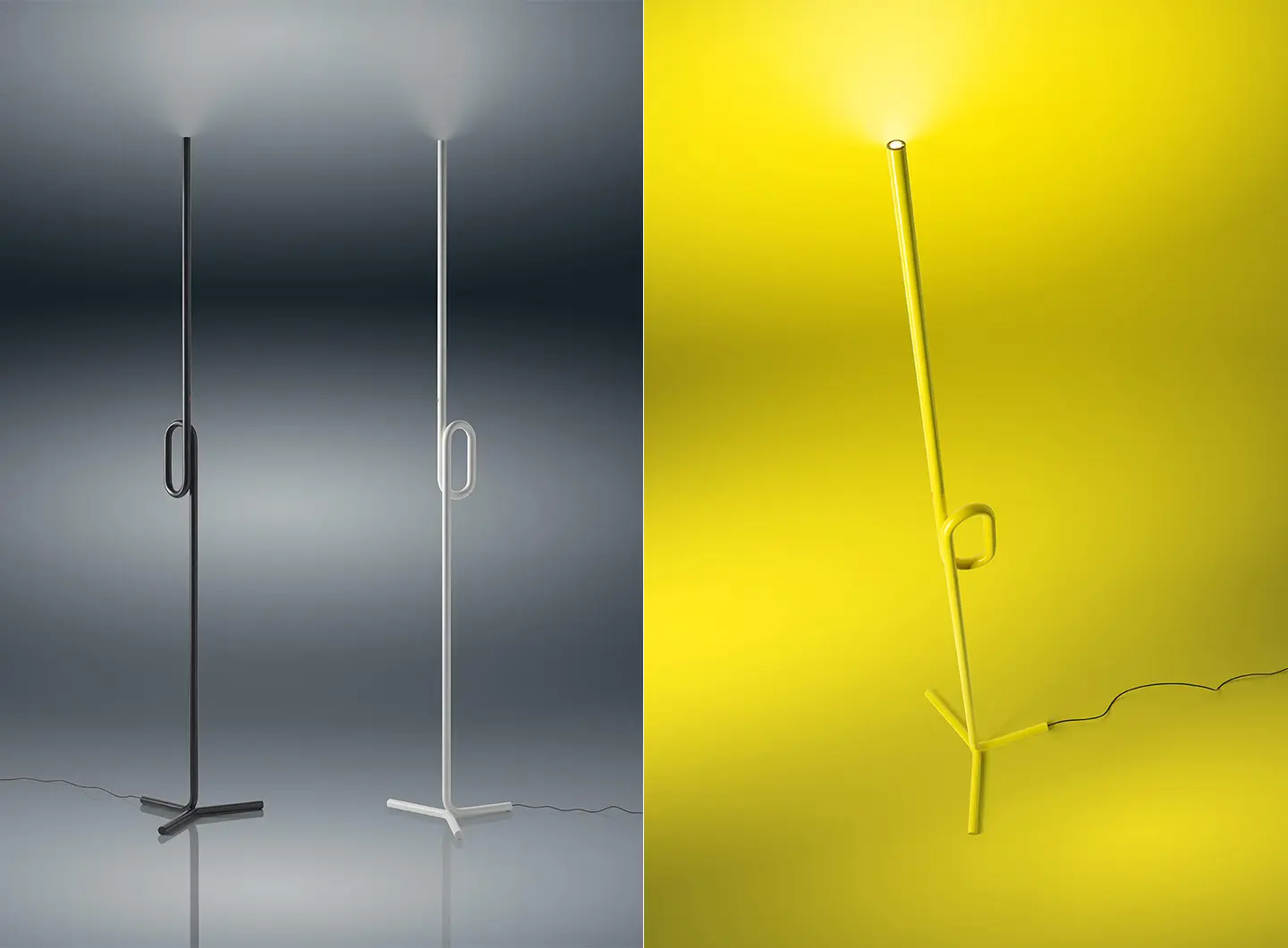
The 2021 colors, chosen by Pantone Color Institute, are Ultimate Gray and Illuminating, a mix of colors that conveys a sense of resilience, strength, courage and positive thinking. Illuminating is a bright and festive yellow, a warm tone that is infused with the power of the sun. Ultimate Gray is a concrete and solid shade of gray that brings to mind reliable – often natural – elements that stand the test of time; a discreetly reassuring color that soothes us, favoring self-control and determination. When they are mixed together, they call for introspection, innovation and intuition, while expressing respect for experience and intelligence and urging us to think differently.
And if, in all probability, we will see it used more often in the world of design in the future, there are a number of companies and designers that have already taken on the challenge with these colors.
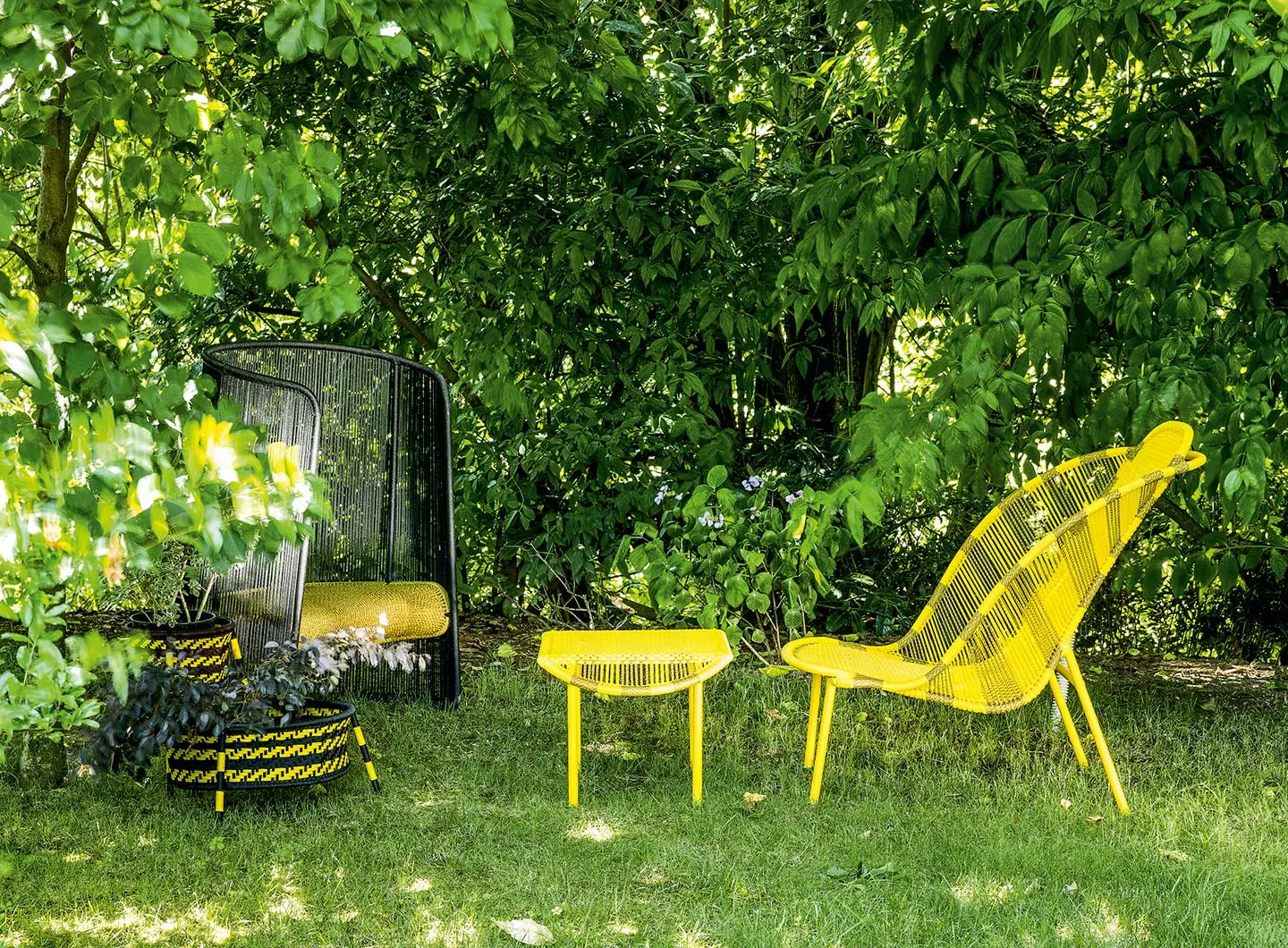
Moroso
Natural gray is the color of the Tip Ton RE chair designed by Edward Barber & Jay Osgerby for Vitra and made from 100% recycled plastic sourced from local household waste in Germany, which undergoes a special creative recycling process. Plastic, metal and other composite materials are first sorted, then plastic is shredded, washed and converted into a re-usable grainy material that is not tinted in any way. This is why you can see tiny spots of color inside the gray, which vary slightly from one chair to another, making each creation unique and interesting, broadening our perception of the material and lending depth and history to it, just like the structure of a piece of wood tells the story of the tree it comes from.
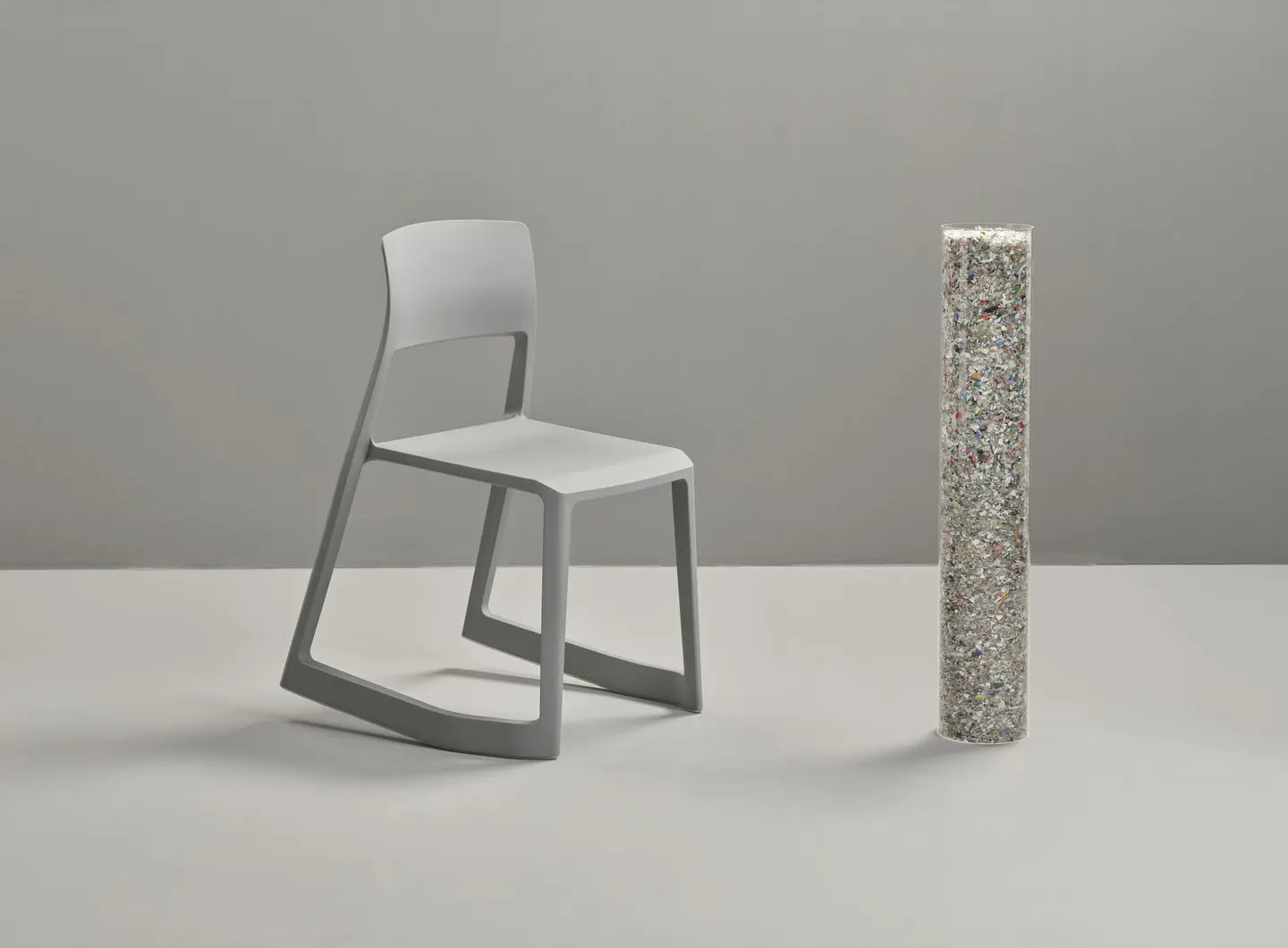
Tip Ton RE, design by Edward Barber & Jay Osgerby, Vitra
Patrick Norguet, instead, chooses bright yellow for the Dan chair by Zanotta. In its hi-tech version, it is a new and essential project: the chair’s straps – which nod to the automotive world − become functional and comfortable performance elements that are designed for a modern kind of storytelling, as they can be customized with graphics or text. Moreover, the product owes its name to the belt ranking system used in Japanese jujitsu, where colored tabs on the belt indicate your skill level. A chair with a sleek structure characterized by just a few elements that, therefore, wishes to be a symbol of a life path, a past experience, a story.

Dan, design by Patrick Norguet, Zanotta
Johannes Torpe also chooses yellow for Precious Chair designed for Moroso: probably because it goes well with the joy and vitality associated with love, which is the source of inspiration behind this item. A wedding ring serves as the starting point, and the details of the object are then developed by reinterpreting the initial inspiration and by trying to make the sections as thin as possible to create a lightweight and elegant product that is the perfect blend of extremely clean-cut shapes and solidity.
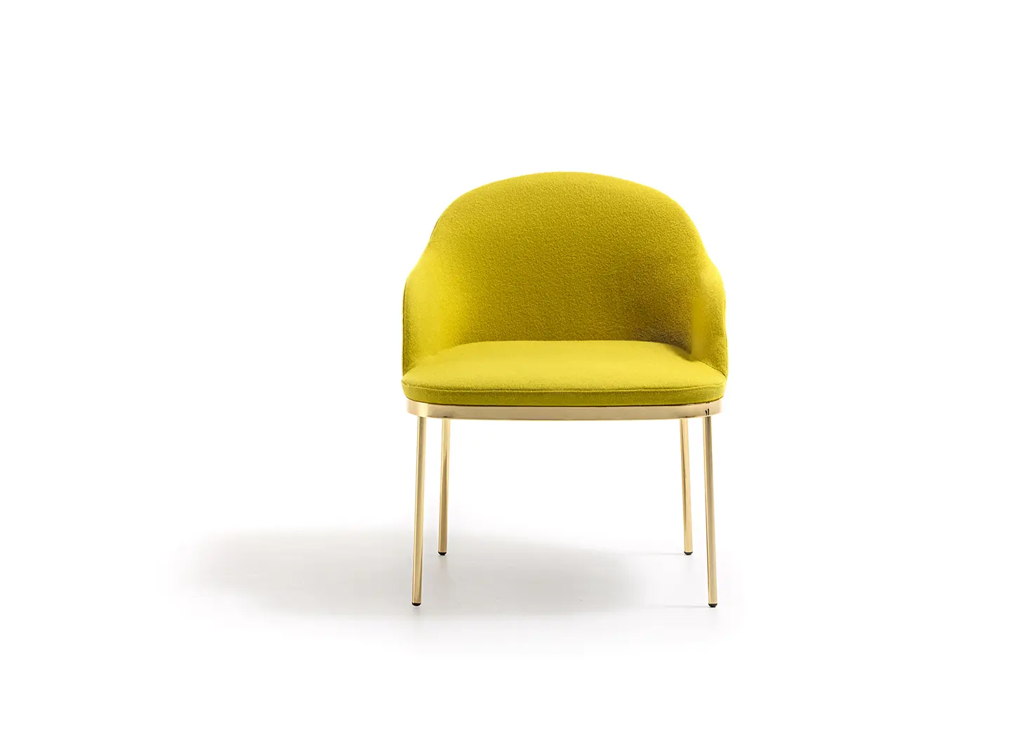
Precious Chair, design by Johannes Torpe, Moroso
A combination of the two colors, instead, for Tombolo by Piero Lissoni for Living Divani, a chair that oozes femininity from each and every detail, and especially from the skillfully embroidered fabrics and the original cover designed by Bettina Colombo and Agnese Selva from UNpizzo studio. Inspired by the ancient Cantu lace making technique, this process uses traditional stitches, such as tent and canvas stitches with the typical twisting, yet revisited with a contemporary flair to create, with an extra-large bobbin and a much thicker yarn, patterns and designs that are always new and innovative.


 Stories
