From urban geopolitics to the biopolitics of bodies, the 24th Triennale - inaugurated by Nobel Laureate in Economics Michael Spence, amongst others, and open to the public until 9th November - denounces the structural inequalities that mark contemporary lives, offering insights and solutions through the contributions of internationally renowned artists, architects, designers and scholars
Giulio Ridolfo, master of colour, on large companies and experimentation
Text by
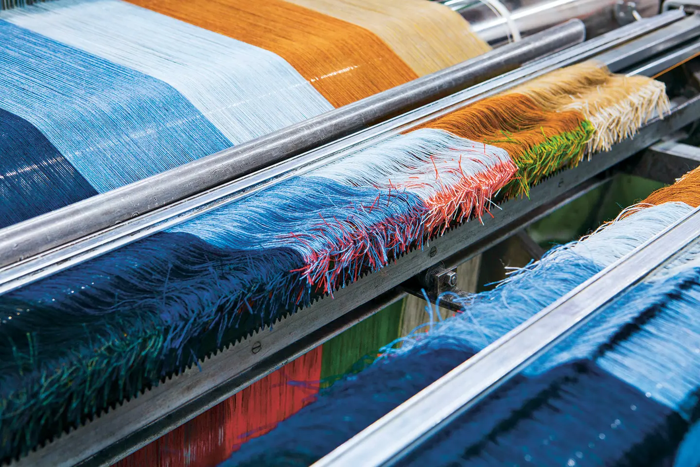
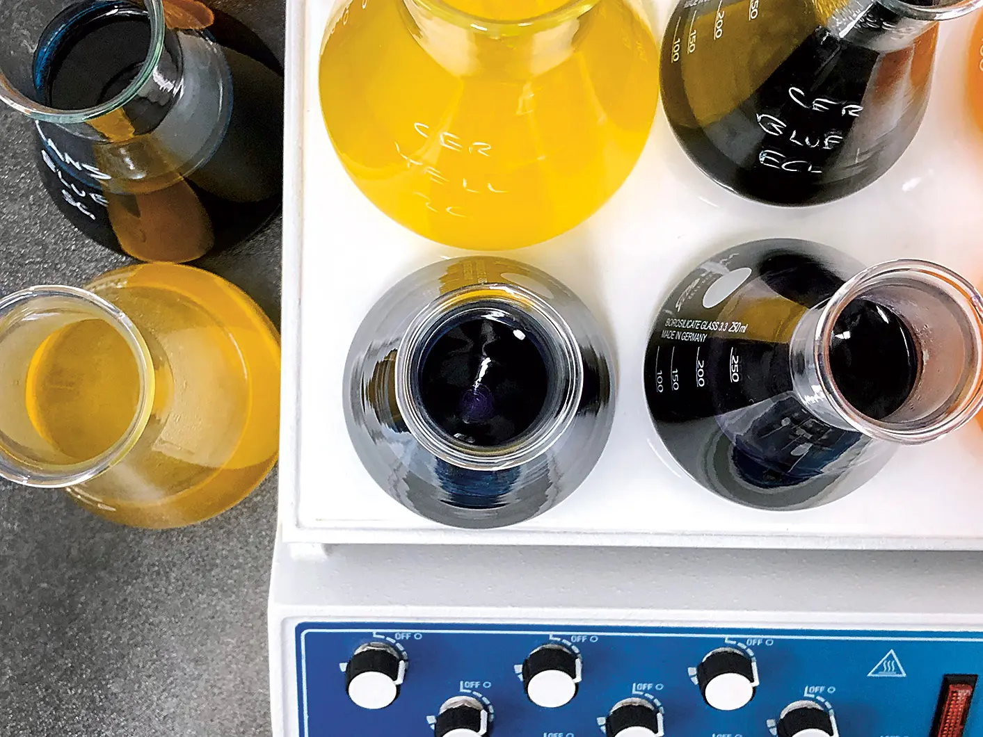
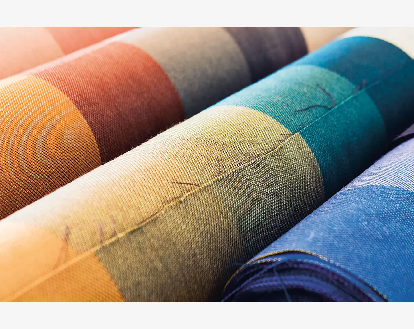
Materialising Colour: Journeys with Giulio Ridolfo (Phaidon), ph. Howard Sooley
The infinite shades of the most sought-after and hungry for life textile and colour designer in the world. Discussing fashion, design and projects with Ron Arad, Antonio Citterio and Patricia Urquiola
Who invented colour? While Goethe boasted of being the only person with the right insight “into the difficult science of colours,” Giulio Ridolfo is certainly a match for him. He is in fact the undisputed king of colours/colourists. Coram populo, obviously, in the eyes of industrial design and the leading European interior, clothing and accessories companies who seek him out as a peerless mentor on the subject. He is worshipped like a god.
Born in Udine, he took his degree in Fashion Design from Milan’s Domus Academy in 1985, since when he has focused on colour as an analogical form of connection with the natural world. The inspiration for his fascinating work is fuelled especially by art, photography, fashion, film, food and masters of design such as Nanna Ditzel, Dino Gavina, Alexander Girard and Florence Knoll, figures for whom colour is a simple and marvellous extension of nature. Curiosity and experimenting with colour is therefore his mantra. Translating colour into textures and patterns is, on the other hand, his job.
Giulio Ridolfo’s philosophy and modus operandi are beautifully discussed in the book Materialising Colours. Journeys with Giulio Ridolfo (Phaidon, 2020, edited by Jane Withers, photography by Howard Sooley), sponsored by Kvadrat, a company leading the way in textile innovation and green manufacturing processes, with which Ridolfo has collaborated for some 25 years, infusing warm Mediterranean sensitivity and sensuality into the essentiality and clarity of Nordic design. The book essentially documents a journey through textiles and colours, seen through the eyes of someone who dreams and continues to dream rigorously in multicolour. It also documents stories of professional partnerships and personal friendships, such as that with Patrizia Moroso, who invited him to collaborate on a number of projects with designers of the calibre of Ron Arad, Antonio Citterio and Patricia Urquiola.
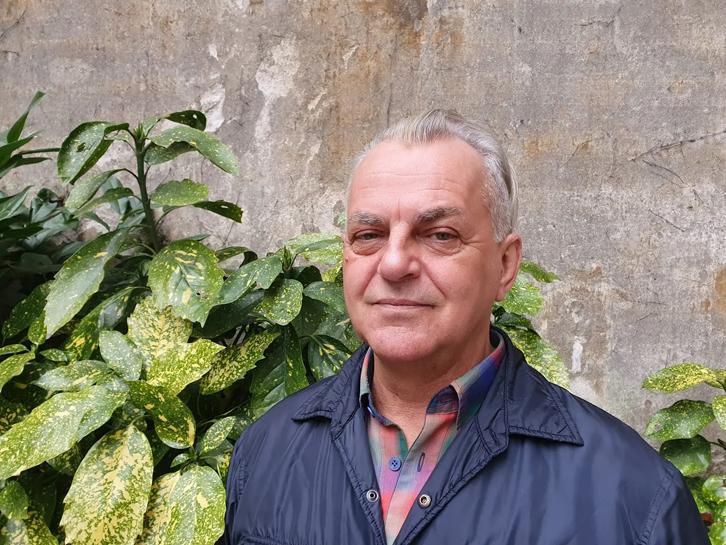
Giulio Ridolfo, ph. Sara Deganello
Colour, for you, is a continuing value, not bound up with trends (as in Pantone of the Year) or a particular time. How would you describe it?
That’s a really great question! Yes, colour is an ongoing theme for me, not dictated by trends, because I don’t do trends or forecasts and I have never even been interested in taking part in those meetings on the colour of the year.
For me it’s an organic component of the material you’re working with, so it’s to do with the materiality and with whatever it is you want to cover. When you’re working with colour, sometimes on specific themes – textiles, plastic or a specific object – it makes sense to work more empathetically with the material itself and work out how to bring out the best of each of them. I’ve always done that and my training in fashion has given me a great deal of experience in mono-themes, such as black. Black reflects very well on some fabrics, and less well on others. Black velvet is not the same as black gabardine.
You started out and continued for quite for some time in fashion, then you went into design. Which of these spheres do you identify with most?
Ah, it was actually a wonderful time! I love the applied arts, and the fact that fashion and design flowed into each other allowed me to take a qualitative leap. I remember one little thing: I was reckless at the time, but perhaps there was a hint of something. When I was a child I wanted to do scenography, but the schools were impossible. When I was 20, I tried to send my material to the Experimental Film Centre in Rome, but they didn’t even consider me. Performance spaces and everything to do with movement around a person has always interested me. I’ve always liked fashion and I still do, but I prefer custom, as in way of life.
Every so often, I see something that betrays a very nervous language. Fashion is suffering from a touch of autoimmunity – and that’s not attractive. It’s a sort of super-speedy narrative, too self-centred, paroxysmal. There are some wonderful high points, though, because there are some very gifted creators, but I’m interested in the long term. I had an amazing teacher at school: Gianfranco Ferré, and I’ve worked with him too. Making a piece of clothing from zero is fantastic. It’s an ancient art, a wonderful one.
But I don’t deny it, I really enjoyed the technical and reflexive tempo of industrial design, furniture in particular, because it gives you more scope. You’re working on objects that can’t be moved around as easily as pieces of clothing and take up space, in a bid for continuity. Which actually doesn’t mean anything because I also really like flashy design. I saw several things in Bologna recently including furniture by Gavina for Studio Simon, which are still part of Bologna. I’ve always liked explorative design, in every field.
I had the honour of working with Patrizia Moroso – it was she who captured me – and with Patricia Urquiola. Both my Patrizias. We’re great friends and we have started working on certain flowers, styles and stylistic features and on the art of furniture, paying a lot of attention to the stitching, the finishes, the sartorial and “couturising” aspects. We overturned some of the classic rules of upholstery - the stitching on the edge, the piping, the refit – they work well, we know them, but it’s also good to try and see the world a bit differently.
If I had to name a particular furniture master, it would be Gavina because he manages to work magic – from the Sanluca armchair to the lacquers, the furniture, the lighting for Sirrah. Those were the years of truly impressive work, which has now become a bit mannered sometimes, and that irritates me. Manner is always a difficult issue – either you’re really clever and justify it, and know how to play on it a bit, or the language becomes so slavish and lifestyle, which as an Italian I detest. We have the culture to create design, not for creating lifestyles.
Can I describe you as the couturier of furniture design? You “cut and sew” the colours that then become major pieces of furniture. How do you choose colours – instinctively or through a meticulous process?
Discipline helps me be more instinctive in the sense that I don’t lose a whole week trying to find a colour that interests me. There’s a gut feeling, a strong one, and there’s a pause for reflection. Here it’s a matter of giving an object a skin – rough or not rough, soft, tactile, gentle, brightly coloured, happy, restrained, nocturnal, it just depends … and these are the thoughts that always come up during the construction of every piece. I’ve been lucky enough to work with great designers who are often wiped out and they don’t want to have to think about colour and say “go on, let’s just do it in black” – which is fine, it’s taking responsibility, a Gestalt concept.
Materialising Colour: Journeys with Giulio Ridolfo (Phaidon), ph. Howard Sooley
Tactility seems to be a determining factor for you. Why is that?
Here’s a banal example – when we go into furniture shops, we say: “what a lovely sofa” and we touch it. That explains everything, and harnessing an ancestral resonance, a sofa is like a great container, like a mother’s womb. Tactility is a fundamental value for an object, but it’s different in a collective space than in a private one: I don’t like having a hairy object in a place where there are 150 thousand people. I like having a skin, a more normal material; I like conferring tactility because in a certain way it’s a sense, like hearing and smell.
The colour aspect is important, obviously, I might say: “what a lovely colour” but I have to touch it, especially where products are concerned. Normally I assess upholstereds, furniture, but also wood, in which case the paint is fundamental. Or a leather women’s handbag, when you’re buying it, you don’t just exclaim: “how beautiful!” - you touch it. That is the assemblage of characteristics that make up attraction towards an object.
How do you tend to work? A very precise method? Pure improvisation? I imagine you’ve put together a spectacular colour collection over the years … we’re keen to know more.
I actually enjoy working and sharing the work with other people. By operating as a group, as I’ve often done with some fantastic companies, you can create a much more profound phenomenon, organic and holistic, because everything comes together. Putting several heads together is the best part. I don’t have assistants and my work is often done on the spot – I go to a company and have to think up ideas there and then and that’s why you need to be very disciplined and when I am working on colours I am very disciplined. Naturally instinct comes into it, but discipline especially.
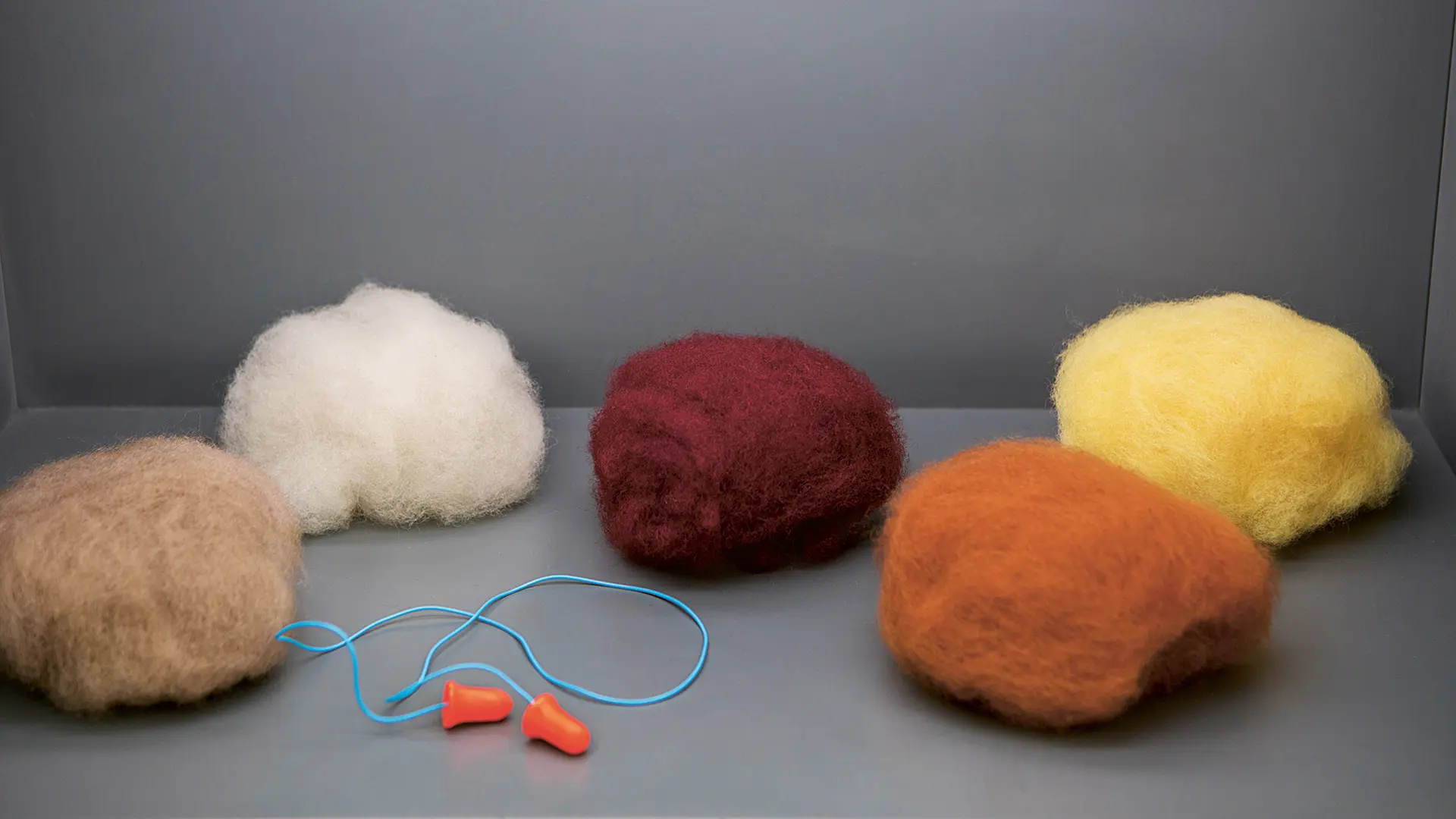
Yes, I do collect objects, but not compulsively or thematically. I always travel with very large suitcases. I’ve nicknamed myself Mario Poppins precisely because of the suitcases and I’m also very analogue. I take books to meetings because I’m not keen on photocopies, I prepare tables. For me working means having a large table on which I can create a collage of objects, of props, or different pieces that I like to demonstrate in terms of liking colour, feel, form and three-dimensionality. That’s my materials collection – using real objects. I know that there are objects that speak to me and that I keep close and which sooner or later may become part of a discussion. Different sorts of objects, plants, photos … I also adore postcards, especially museum ones, because they are very beautiful and are the perfect thickness. I also love paper, the colour of the samples, like the metallic paper chocolates come in. Have you noticed what magnificent colours they are? It’s all a huge learning curve!
In her book, the author of Materialising Colours says that colour has become a somewhat mechanical thing and that relying on colour charts has increasingly little relationship with the cultural context, but that colour designers have breathed new life back into craftsmanship and given new meaning to colour. You are one such, one of the few in fact. How do you reconcile the use of a colour grading system with a less mechanical approach? Are there other systems apart from the one drawn up by the American painter Munsell in 1905 and the NCS one devised in Sweden over 79 years ago. Is there one that you favour?
When it comes to the traditional systems, let’s say that it depends on what I have to do. I wouldn’t dismiss the classic German RAL, because it has some very mechanical paints suitable for industrial use. I can tell you what I don’t like much – I’m not the Pantone type, it’s temperamental, but I am very keen on the NCS because it operates on plays of shadow and light, and is much, much more practical for me because it applies extremely well and is true enough on plastics and textiles.
I recently discovered what might be called an intuitive, really beautiful system, called kt.COLOR which is pigment-based, so it uses natural pigments. It has some really interesting shades, from earthy Sienna to lapis lazuli to Veronese greens, pictorial colours basically. I also love going to fine art shops and I often buy pigments. I look at them, because they are one of life’s great joys for me.
Materialising Colour: Journeys with Giulio Ridolfo (Phaidon), ph. Howard Sooley
Let’s end with this interesting book which unveils your world, taking us from your native Friuli to Denmark, in the Kvadrat headquarters, and on to India, in a quest for the true, unmistakable indigo, and then back through Europe and its lights, the Yorkshire light. How did this thick travel journal come into being?
When it was proposed to me, I didn’t want it to be a coffee table book, but something that could be consulted on various levels. I was happy for it to be about me and helped to explain my modus operandi. But it also had to be a dictionary and history of colour. It was like putting several chapters together. Books on colour can be abstract or very difficult. Either you write a textbook or you play the colourist. I loathe being described as a colourist because I’m not a colourist, I just use colour. You have to mix different things up to attract readers, and the final travel journal is what changes the steps a bit.
Materialising Colours came about because the owner of Kvadrat was keen. He said “Giulio, the way you work is so different, so latitudinal compared with the Danish way, which is so pleasing yet a bit static. We would really like to do a book on the way you make colour.” “Yes, I can do a book on colour, but I wouldn’t know how to do it by myself,” I replied. “I’d like to form a sort of scientific committee where I can discuss things with some people who are designers so that we can create a box of content.” At the time, I had already been interviewed by Jane Withers, the design curator, consultant and writer, very clever, an ecologist who is doing some wonderful work on water and who is curating the 27th edition of the BIO biennial in Ljubljana at the end of May. After a couple of preliminary meetings, we decided to create a team putting together my work, Jane’s narrative and photographs by Howard Sooley, whom I love and whose photographs in The Garden of Derek Jarman I knew well; it was the last book the British filmmaker wrote, on his garden-paradise in Kent. Then someone suggested the graphic designer John Morgan, very serious and not trendy, who works with David Chipperfield and with a lot of artists. Lastly a couple of visiting editors such as Anniina Koivu and Aditi Ranjan became involved – the latter is a woman who’s an expert on India, who set up a highly thought-of school in Ahmadabad. The book was the perfect vessel.
I insisted rather on the idea of a story because, obviously, the thread that links my native Friuli to the Danish skies and to India is a part of me. India is a country that I know well culturally and which symbolically has given me a lot and liberated me, teaching me that colour is a really important thing. There’s no need to rush. Colour will come if it’s meant to. I found that out from lots of things. There’s this overwriting in colour, it’s all a continuum, like Paul Klee’s magnificent language and certain writers like Herman Hesse.
Can you give us a hint about your upcoming projects?
Yes! A couple of great things are in the pipeline. Last year I got to know Mexico, to such an extent that I took a small house there, it’s a land that Tina Modotti, my compatriot, knew well, as did Irving Penn and many other wonderful people who have travelled far and wide. It’s quite revolutionary and very beautiful, and there I will work on some craft projects there with the idea of presenting them in a Nordic gallery in a couple of years’ time. It’s a work of cultural anthropology. I was very taken by some things, like the bordado, the sentimental embroidery, a form of writing. Embroidery is something that overwrites, an extremely fascinating subject that I will certainly incorporate.
Then there’s an interior project in Germany. The owner got in touch with me through the book, struck by the way I treat colour. Lastly there are some large and small furnishing projects: I’ll be in Milan with a Friulan company that’s exhibiting at the Salone del Mobile in June. I’ll be working on an upside-down colour concept, but I can’t tell you much about it … it involves curved metal, a very new thought for me.
Materialising Colour: Journeys with Giulio Ridolfo (Phaidon), ph. Howard Sooley
Materialising Colour: Journeys with Giulio Ridolfo (Phaidon), ph. Howard Sooley
Materialising Colour: Journeys with Giulio Ridolfo (Phaidon), ph. Howard Sooley
Materialising Colour: Journeys with Giulio Ridolfo (Phaidon), ph. Howard Sooley
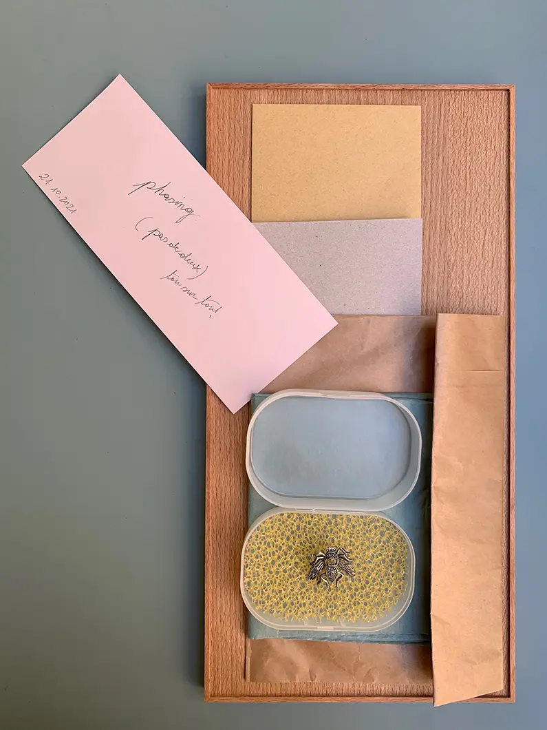
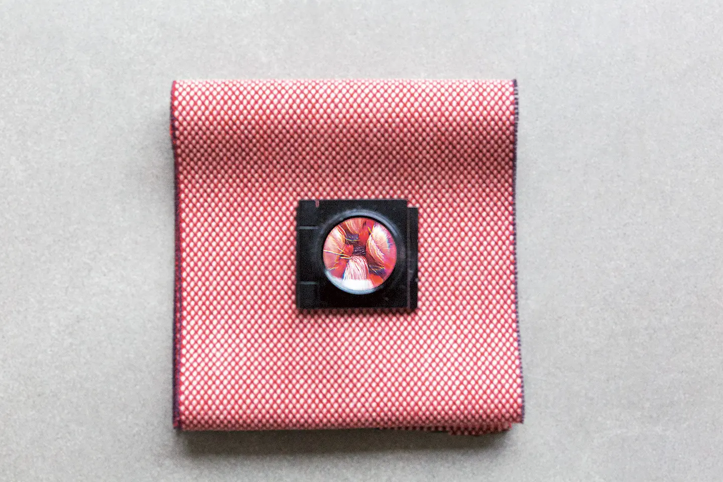
Imparaticcio, for Kvadrat
22 February 2022
Share