Before him, the object counted more than the designer. As of 1984, the designer has become the object. The story of a career built on image, and the objects that contradict it
His passion is aesthetics, visual culture as related to design. His designs, messengers of joy and energy, draw on the past to become symbols of the present and reflections on the future.
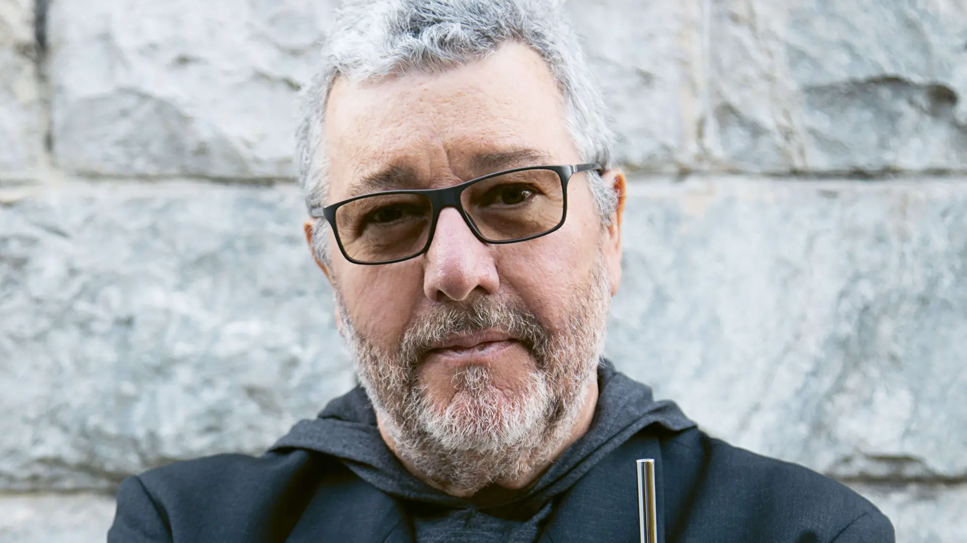
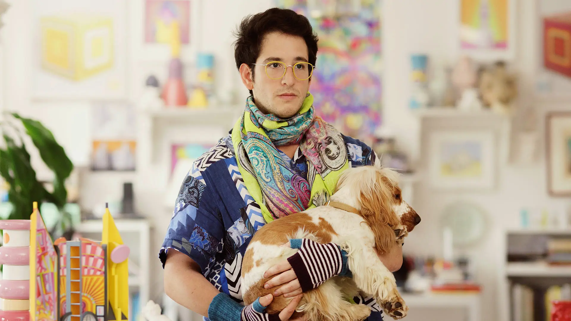
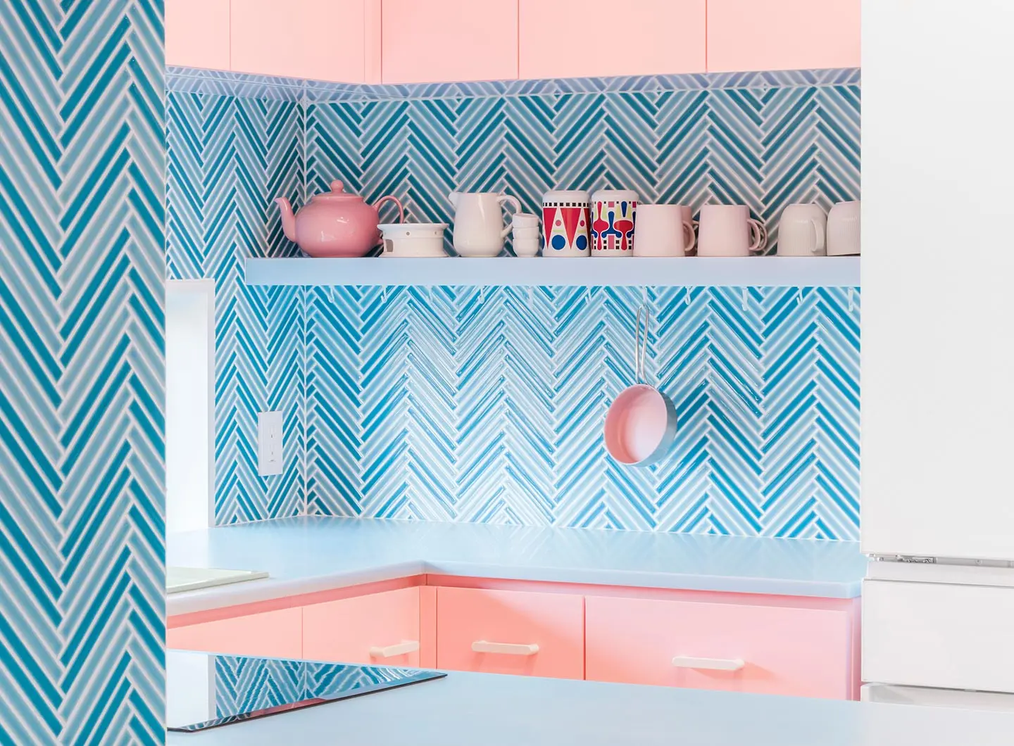
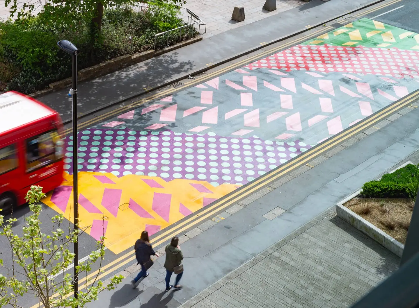
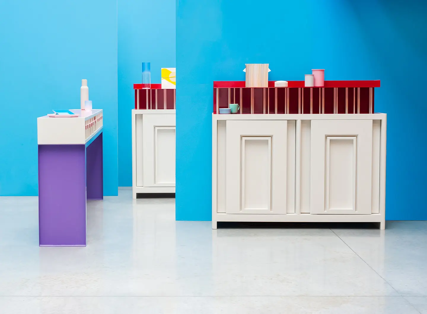
Intellectual and ironic, eclectic and multifaceted, lively and defiant, Adam Nathaniel Furman is a young interior designer, architect, writer and filmmaker. A Londoner by birth - his father is Argentinian and his mother half Japanese and half Israeli - he leaps easily from one culture to another, shaping an irreverent universe composed of a thousand shapes and colours – an ode to freedom first and foremost, where sacred and profane, present and past merge into a single arc of possibilities, achieving new forms of aesthetic freedom. His design is accessible, usually adorable, often mischievous, always passionate and inspired by the (very Londonesque) theme of Queerness. Colour and decor, the outcomes of very precise political-aesthetic projects, are the protagonists of his objects, his spaces and his installations, all expressions of the many fluid and diasporic cultures and knowledges in which he has been immersed since childhood. His easily-recognised projects are distinguished by their psychedelic colours and graphics, drawing on the past (the idea, the forms and the meaning) to become totemic elements of the present, sparking reflection on and for the future. Above all, they are messengers of (cheeky) happiness, (sensual) pleasure, (critical) energy. As a designer, Furman’s mission is to fight for the sort of world he craves – free, open, beautiful, overflowing with love, shared, intellectual and, frankly, enjoyable – through design.
Adam Nathaniel Furman has taught at London’s Central St Martins University of the Arts, carrying out research in the fields of urbanistics and architecture. His many accolades include the prestigious UK Rome Prize for Architecture in 2014, and he has been described by Rowan Moore, architecture critic for the Observer, as one of the rising stars of design.
The Milanese Camp Design Gallery presented his collection The Royal Family, created in collaboration with Abet Laminati, at Milan Design Week 2019. His solo show Historical Promiscuities, curated by Luca Molinari, was held during the same week at the Vudafieri Saverino Partners studio, in collaboration with Bitossi Ceramiche.
You are a “Londoner”, your father is Argentinian and your mother is half-Japanese, half-Israeli. Does this cultural heritage influence your way of designing?
Inevitable yes it does, in the sense that I am extremely open to, in fact actively seek out opportunities for the mixing of influences, cultures and styles. Growing up in an indeterminate zone between not belonging, and fiercely desiring to belong, but to multiple places and affiliations at the same time, none of which one can ever really be fully be a part of, but each of which you love with a great passion, is a point of view that never really leaves you, and still to this day I tenderly weave together disparate influences from multiple places and times, creating my own new contexts, forms and ornaments, that echo the rich and productive in-betweenness that I experienced growing up.
Intellectual, ironic, maverick, brave and lively: that’s your design. What have we forgotten?
Haha, thank you! I recently was asked how I would summarise my style, and I said its the embodiment of a kind of "fuck-you happiness", and that is probably very apt, in the sense that I have been told consistently throughout my career that what I do is wrong, bad, inappropriate, unfashionable, not desirable, stupid, and that has always just made me more defiant, more forthright, and I would say more proud. I try to project a kind of angry joy, a sense of pleasure and sensuous enjoyment that is insolent and has emerged hot and full of boundless energy from a place of separation and disregard.
You wrote a book regarding Postmodernism — Revisiting Postmodernism — and , meanwhile, you lead an association for the celebration of classical and modern architecture. For which style beat your heart? Or which art is closer to yours?
As I explained in my book, my interest was not in the period as a style, but as a spirit of open exploration in which aesthetics in design took up multiple meanings and endeavoured to express and represent the complexity of the contemporary condition through visual culture, something that has been excluded from design for many years now, which I find shocking in an era in which Identity is one of the most important and controversial topics in the world, and yet design does not in any way address this. So The Postmodern period was of historical interest to me for the problems it addressed through design, not for black and white stripes or wiggly patterns, which were just one of a myriad of formal outcomes over the era. Classicism and Modernism are of interest for similar reasons, in the sense that I’m interested in alternative histories of both movements, the Queer side of Classicism, and the Queer side of Modernism, both of which were constantly present from the inception of both languages (in the modern era at least, post-renaissance). Both were universal languages of white, western male hegemony, and yet they were consistently recoded and transformed in extremely interesting and subversive ways, making the mainstream become a vehicle for those who lived differently to hide, design, and operate in plain sight. From Winckelman to Barragan. So my interest in Postmodernism and Classicism and Modernity are all very specifically geared towards an interest in how alternative identities can find ways to manifest themselves in the public sphere, in a tense dialogue with mainstream taste-cultures.
How does history shape your art? May you share with us the concept behind Historical Promiscuities, your exhibition curated by Luca Molinari, with the contribution of, and in the studios of Vudafieri Saverino Partners?
History is hugely important to me, but again, it is about taking accepted historical narratives, and upending them, mixing and distorting and refashioning them in ways that reveal how history is not a fixed chronology, but something always under negotiation and always full of disagreements, with winners and losers, and those who have been forgotten and should in fact be resurrected. So now there is a wonderful movement of reclaiming and bringing back into the narrative so many female artists, designers and architects who have been systematically ignored. Similarly there are new ways of interpreting already celebrated designers and architects, those who were crammed into uncomfortable boxes by the strict interpretations of modernist historians, freeing them to be seen in much more interesting and expansive ways, notably Queer practitioners whose body of work can now be understood much more in relation to their hidden otherness. So I am deeply immersed in history, but whilst always and in every project trying to refashion it in new and revivifying ways, ways that cast new light on forms from the past by dragging them into the present, mixing and transforming them in a manner that implies new and refreshing narratives.
And the idea behind Roman Singularity?
It is very much along those lines, it is a contemporary version of a designer on the "grand tour", re-imagining Rome and its present, its past and its potential future through the eyes of a colourful 21st century visitor who delves deep into the stories and mythologies of the place, but does not accept any of the given interpretations, neither of previous foreign visitors, nor of the somewhat calcified academics of the city itself. The aim was to put Rome in a disco blender of queer cosmopolitan delight.
What is colour for you? Is it a metaphor? A symbol? Or what else?
I have always been very interested in the use of colour, in fact I've co-directed a research group on the subject at the Architectural Association for the past eight years called Saturated Space http://www.saturatedspace.org/ (we've had nine lecture seminars, and published numerous academic texts) which has helped bring the subject much more attention in the academic world over that timeframe. My passion is aesthetics, visual culture in relation to design; and colour, its use and deployment, is probably the most powerful and fundamental way that a designer can create immediate and potent reactions in users, occupiers and observers. It is always used, but is perpetually under suspicion as being "childish" or "superficial", to the degree that those who utilise its potency with great flair -whether they are highly theoretical and political themselves or not- are often themselves dismissed as unserious designers simply because of their use of colour, whereas those who studiously avoid the use of colour are often perceived inversely as serious -whether they are superficial and faddish themselves or not.
Your relationship with form and function?
A silly false opposition. In any case for a child of immigrants for whom the most important function of objects was their symbolic value, the way they carried memories of lost homes and lost friends, the way they carried the burden of anchoring a family in a new place with a sense of belonging and shared meaning and history, the way they represented us in a place where we were not represented, how could I accept such stupid and narrow definitions of function as were laid out in the modernist textbooks? I felt the entirety of my identity and interest in design was erased in their reductive dogmas. So form and function go together, but for me function is use in a much broader sense than just a chair being something that holds you 45cm above the ground, it should also embody values and ideas and identity and joy and sadness as part of its function...
Have you ever visited Salone del Mobile.Milano (the fair) and SaloneSatellite?
Yes of course! I very much hope to be actually involved in it in the future. I have been very keen to work with Italian brands, but so far no luck. I am waiting.
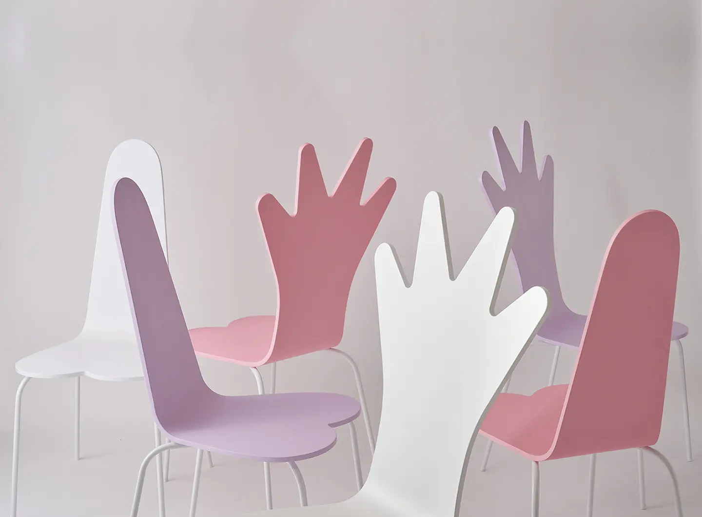
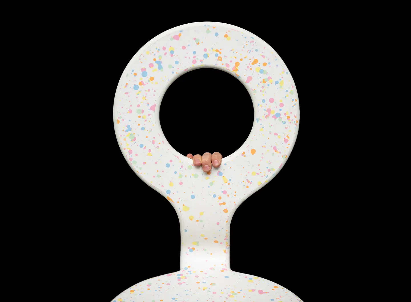
PHaB Chairs - Photo by Yeshen Venema
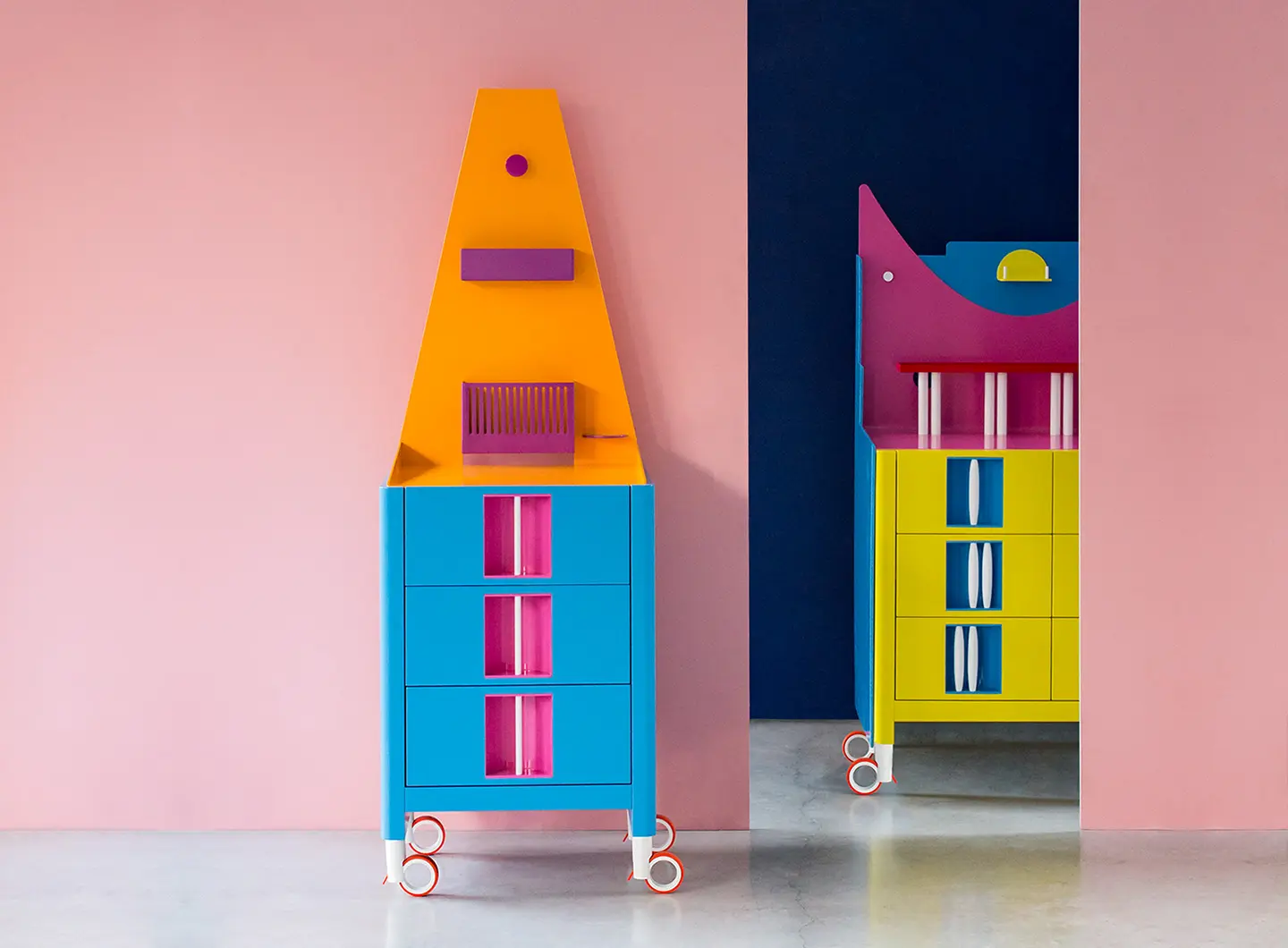
Nakano Twins
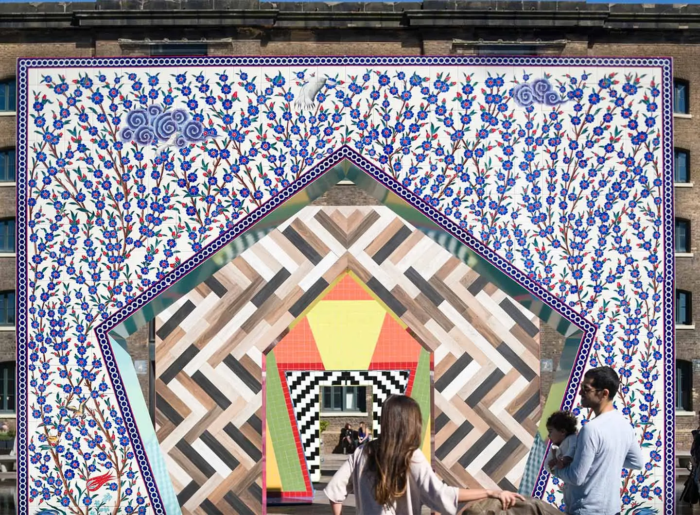
Gateways - Photo by Gareth Gardner
Hitotsume-kozō - Photo by Johnny Barrington
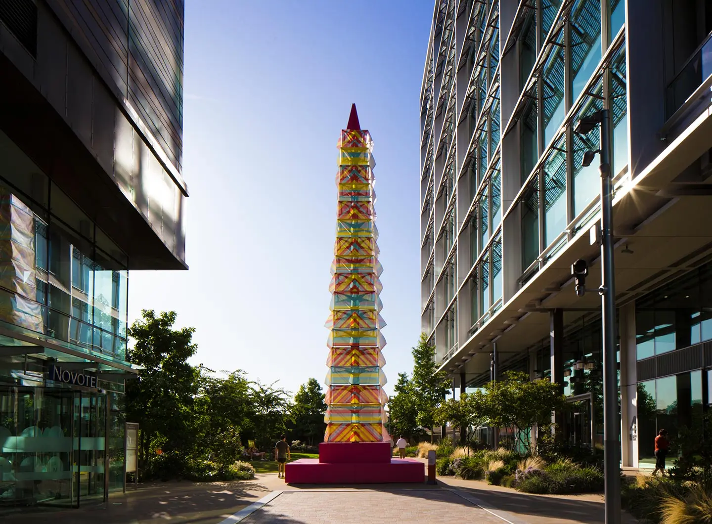
Tower of the Winds
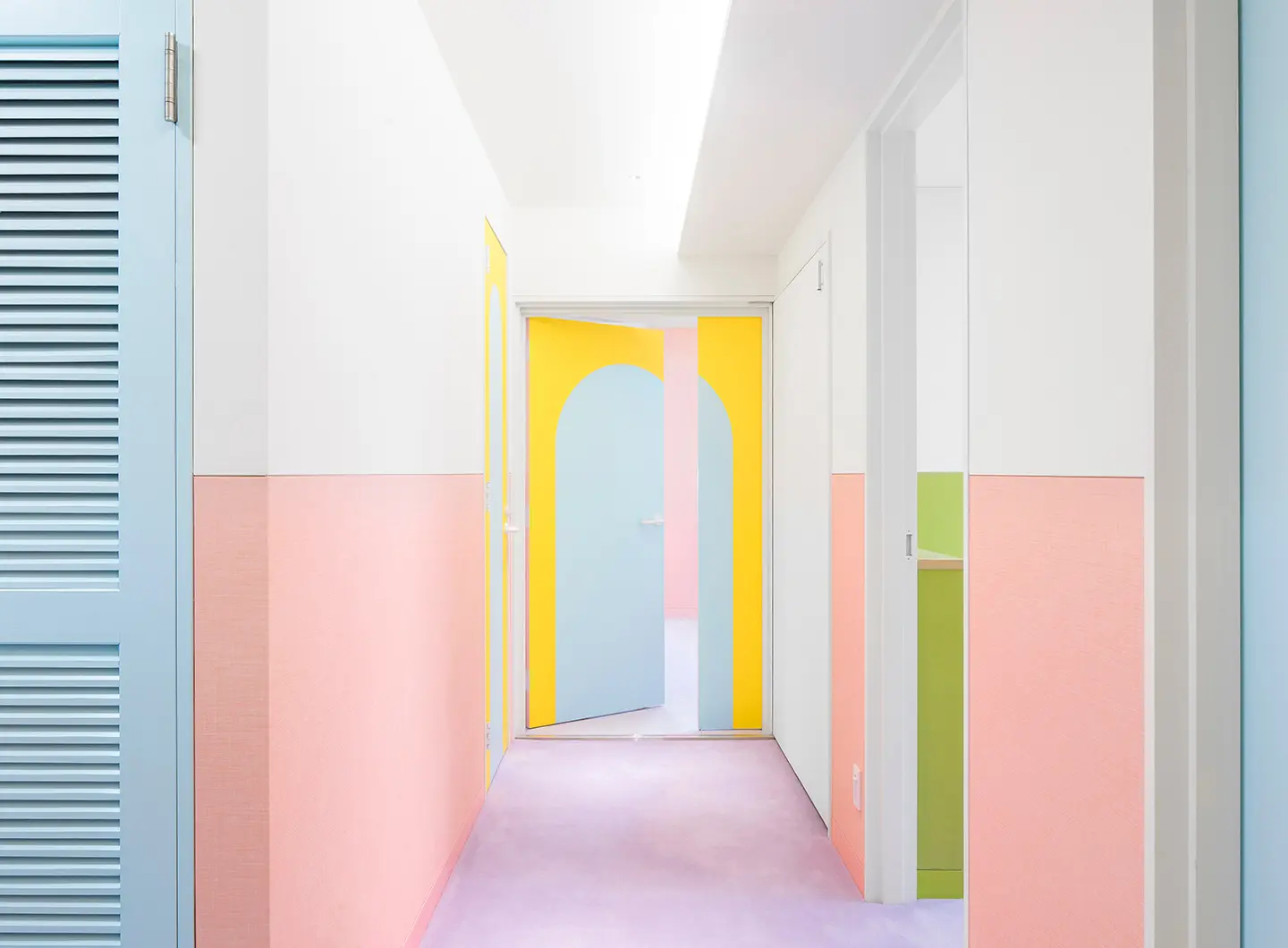
Nagatacho - Photo by Jan Vranovsky
Nagatacho - Photo by Jan Vranovsky
Look down to look up
Monaco
28 October 2019
Share


Road to Salone 2027: the SaloneSatellite Permanent Collection makes its debut in Jakarta
Indonesia will be the first stop on the Salone global tour: from 18th September to 18th October 2026, at Indonesia Design Week, the SaloneSatellite Permanent Collection will showcase 27 years of talent, enterprise and the future of design


Architecture on the water: 10 projects to discover
Some buildings gaze at the water from above, others allow it inside; still others descend beneath it, and there are even those that float on it all through the summer. Ten buildings, from 1935 to the present, tell the story of the many ways design engages with an element that is never still
